New Concepts

New Concepts

  • عالی

    رای: 126 62.4%
  • خوب

    رای: 56 27.7%
  • متوسط

    رای: 13 6.4%
  • بد

    رای: 7 3.5%

  • مجموع رای دهندگان
    202
  • نظرسنجی بسته .

کدخدا

مدیر بازنشسته
The World’s Largest Fountain in Dubai

The World’s Largest Fountain in Dubai

The World’s Largest Fountain in Dubai

Dubai’s prominent developer, Emaar Properties said on Monday it plans to build one of the largest fountains in the world as the centrepiece of its Downtown Burj Dubai project. Arabian Business reveals what the real estate giant has in store.


The fountains, which has yet to be named, will be capable of shooting water over 150 metres into the air, the height of a 50 storey building, and stretch over 275 metres, the length of two football fields.


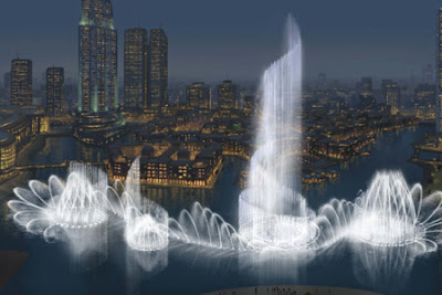
The $218 million project will be 25 percent larger than the iconic fountains at the Bellagio Hotel in Las Vegas.


Like the Fountains of Bellagio, Emaar’s fountains will include an integral light and sound show and is expected to become one of Dubai’s major tourist attractions, drawing over 10 million visitors per year.


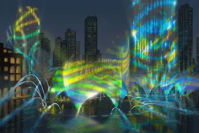
The fountains will shoot 22,000 gallons of water in the air at any given moment and feature over 6,600 lights and 50 colour projectors.


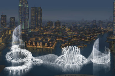
The fountains have yet to be named and a cash prize of $27,225 has been assigned to the winner of a competition to name the water feature.


The structure is scheduled to be operation by 2009.


http://funhigh2.blogspot.com/2008/09/worlds-largest-fountain-in-dubai.html
 

کدخدا

مدیر بازنشسته
Stable structure

Stable structure

Stable structure
70F architecture’ s Sheep stable In Almere, the Netherlands provides more than a home for the much needed sheep

The city of Almere has a sheep population of about 80. The sheep are mobilized to keep the powerful weed “acanthus” or “bears-breech” that grows in the “vroege vogel” - forest and “kromsloot” - park in Almere under control. To centralize and house this population, a sheep stable was needed.
The stable is designed with an a-symmetrical homogeneous cross-section. The part of the building where the sheep reside is relatively low; the high part is situated above the (public) pathway and the hay storage section, making it possible to store a large amount of hay. The shape also creates a natural flow for the air inside the building, which is refreshed by two slits at the foot of each long side of the building.
The detailing of the corner of the building, where the long façade ends and the gable starts, is extremely important for the overall experience of the architecture of this building. It emphasises the cross sectional shape of the building, and finishes the long façade of the building, which starts as a façade and slowly becomes roof.
The construction (pine) and cladding (Western Red Cedar) are made of wood. Only the curved girders are made of steel. This was done to emphasise the tube-like shape of the interior, which would have been less strong using twice as high wooden girders. All vertical walls in the stable and office are clad with beech plywood.

The stable is designed to make it possible for the public to visit the building and experience the keeping of sheep up close. At one end of the building, on the second floor, a room for the shepherd and a small office is realised. There are sleeping facilities for the shepherd, who has to stay over night in case any sheep are lambing. Work in and around the stable will be done by, amongst others, people who live with a mental social or psychiatric disability, supervised by the shepherd.
Apart from the public function, the Muslim community of Almere will be able to buy the lambs they need for yearly ritual purposes.


کدخدا

مدیر بازنشسته
Toy library in Bonneuil-sur- Marne

Toy library in Bonneuil-sur- Marne

Toy library in Bonneuil-sur- Marne
by LAN Architecture


July 24rd, 2008
Paris-based LAN Architecture have renovated a building on a 1960s social housing estate in Bonneuil-sur- Marne, France, to create a toy library for children.​
The project involved creating a free standing, cast-concrete shell around the existing two-storey building.​
The following information is from the architects:​
–​
Children Toy Library – Bonneuil-sur- Marne, France
LAN Architecture, Paris.​
The Children Toy Library of Bonneuil-sur- Marne is a public building as well as a playing space for children: the project represents the opposition between monumentality and conviviality, a dialogue in the same construction.​
It is located in an area where social housing from the 60’s have a strong physical and social impact. We designed exterior and interior spaces respecting both strategies.​
The building façade, as a shell, is linked with its urban context, translated into its shape, monolithism and strictness. We wanted to create a strong urban symbol, disconnected from its environment and whose shell could protect its core and participate to the regeneration of Bonneuil-sur- Marne social structures.​
Rehabilitate - Renovate
Architecture alteration: towards the shell​
The Children Toy library of Bonneuil-sur- Marne was created in a crossed reflection on several axes:​

  • Changing destination and utilisation of an existing building
  • Conception of a playing area for children
  • Creation of a public equipment in an unstable area through a small scale project compared to the surrounding buildings
  • Confrontation with a very restricted budget (originally planned for internal arrangements)
We decided to set up an unscaled and timeless design, a solid mass object, an urban symbol able to separate itself from its environment, that is able, like a shell, to protect its contents; a volume that seemingly always existed, looking-like a bunker or a vernacular construction.​
A new skin for an old body
Our strategy was inspired by a medical logic of intervention. The creation of a supplementary freestanding skin allowed us to control the interface between exterior spaces, building and interior spaces, but also to answer the requirement to create spatial benefits.​
The new facades juxtaposed to the existing building, create the alteration, adding a monumental entrance, a new open courtyard on the first floor, and supplementary surface for administrative spaces, saving the original concrete structure. The shell is a green-tinted raw concrete cast into coffering simulating wood slats.​
The opposition between the hermetic and closed outside and the coloured internal spaces represents another interest of the project. Children play in a sort of cocoon, rich in light variations, rising up over the two levels, in a simple, functional and intimate scale volume.​


کدخدا

مدیر بازنشسته
Queens Museum of Art

Queens Museum of Art

Queens Museum of Art
Queens, New York In January 2002 Eric Owen Moss Architects of Culver City, California won first place in a design competition for the expansion of the Queens Museum of Art.
“Moss took the shape of the Panorama and rather than hiding it, he made it a feature that becomes very active. His scheme has enormous sophistication.”
Peter Eisenman, Juror

Image courtesy EOM Architects
The Queens Museum of Art (QMA) is located in Flushing Meadows Corona Park and currently occupies half of the New York City Building; the only surviving structure from both the 1939 and 1964 World's Fairs. The other half of the building currently houses a skating rink, which will be relocated. The museum will expand to incorporate this space, effectively doubling its size from 45,000 to approximately 100,000 square feet.
The museum is the home of the Panorama of The City of New York, the world's largest architectural model.


Sketch courtesy EOM Architects
The initial design gesture is surgical - the center portion of the building is removed - roof, perimeter walls, and first and second level circulation, exposing the Panorama enclosure as a primary solid.

Model Photo courtesy EOM Architects
Steel roof trusses remain and a re-enclosed central volume surrounding the Panorama becomes the spatial main event for public promenade, art display, music performance, dramatic presentation, and as yet unnamed art of all sorts.

Model Photo courtesy EOM Architects


Image courtesy EOM Architects
Cross Section
The Main Event space will be open and flexible. The original floor is removed and the earth excavated, leaving a bowl, gently sloping toward a theoretical center at the base of the Panorama. Temporary seating, oriented toward the Panorama, can be placed within the bowl - an (almost) theatre in the round. Exhibits can be mounted variously over the sloping surface - “stages” within the “theatre” - or hung from the trusses above.

Image courtesy EOM Architects
Longitudinal Section
Connected to the Main Event space by a carefully orchestrated promenade are the bookstore and café, the Panorama, the World’s Fair and Tiffany’s permanent collections, and the temporary gallery spaces.

Image courtesy EOM Architects
A new public circulation ramp climbs the exterior wall of the Panorama enabling views of the Main Event from above. From the second floor, a second ramp up the face of the Panorama provides access to a glazed, multi-purpose exhibition, performance or meeting space with views down into the Panorama exhibit, the Main Event, and the surrounding site. Screen(s) may be attached to the ramps so that film or video may be viewed in the space or projected through the glass to the park outside.

Image courtesy EOM Architects
Unique among the temporary galleries is the double-height multipurpose space that allows a variety of changing exhibits to be installed. For the largest exhibits and performances, the main space and gallery can be used contiguously by opening the five vertical lift glass doors that divide the space. Individual exhibits or performances can be segregated in countless ways through the use of flexible and moving partitions. Spanning the double-height and Main Event spaces are two catwalks, facilitating objects hanging, projection and lighting.

Image courtesy EOM Architects
Ongoing exhibits or performances can be viewed by the public in transit, which is encouraged to pass through the Magic Mountain and Main Event space on the way to the zoo, the park, Shea Stadium, or U.S.T.A. National Tennis Stadium. Pedestrian circulation on the site has been redirected from the Beaux Arts axis, affording the option to pass by the perimeter of the Main Event space, viewing the exhibits without actually entering the galleries. The intent of this organizational gesture (“short-cut”) is to expose the broader public to contemporary art.

Model Photo courtesy EOM Architects
The earth excavated from the bowl will be reused to form a linear mountain, creating a presence along the Grand Central Parkway. The west end of the Main Event’s grass bowl extends, becoming a sculpture garden to be viewed both from the Parkway and the Museum. Taking full advantage of the Magic Mountain, Museum storage is placed within the mountain, underneath the sculpture garden. The grass embankment provides informal seating or gathering around an exterior exhibit/performance area.

Sketch courtesy EOM Architects

Model Photo courtesy EOM Architects
A laminated glass “drape” re-encloses the Main Event area. The glass will be transparent, translucent, or opaque by turn depending on the exhibits inside. Glass color is controlled by low voltage wires, which alter the glass from clear to opaque milk white. Water from the drape drains to the two reflecting pools on either side of the east entrance.

Drawing courtesy EOM Architects
Ground Floor Plan

Drawing courtesy EOM Architects
Second Floor Plan
The design strategy for the QMA uncovers the organizational strengths of the original building and simultaneously suggests new prospects for public participation, exhibition and performance space.
Seen at speed or on foot, the QMA will communicate a powerful and intriguing long distance profile.
 

کدخدا

مدیر بازنشسته
One step back and two steps forward

One step back and two steps forward

One step back and two steps forward
RMJM's New York and Dubai offices work to bring the old back into New Dubai

Around Dubai, towers spring up almost in the blink of an eye. Glass and steel permeates the skyline creating a jagged, sparkling and intensely futuristic cityscape. But within this towering city a new type of futuristic landscape is set to challenge this aesthetic. International architects RMJM have been chosen by investors Nakheel to design Madinat Al Soor – a pedestrianised city which will house 22,000 new residents.​
Part of OMA’s Waterfront City, Madinat Al Soor will occupy a much lower profile across the water from the “Manhattan of Dubai” says RMJM’s Design Studio Director Steven Gifford. “What’s different about it is, in Dubai, it’s a harsh climate in terms of heat planning principles. Even the idea that people will walk fairly significant distances, that is fairly different for Dubai . This is not a high-rise city.” He adds, “This is almost like the Greenwich village or Soho of New York.”​
Pedestrianisation is the key to the design in this city. It is being designed to be “so pedestrian friendly that people would be happy to walk two miles,” says Gifford. “The elevations will have a lot of sun shading - it is about controlling light and shadow to make it beautiful and allowing people to enjoy being out in it and not just in their buildings.” To achieve this, the buildings themselves will shade other buildings. Instead of the wide streets typically constructed in ‘New Dubai’ much narrower streets will be built creating much needed shade from the extreme temperatures. Gifford explains that intriguing design is important in encouraging people to walk rather than take other transport. He advised that the design will look to inspiration from “great examples of architecture throughout the world which offer a pleasant, humanistic feel – we are looking to bring this back into Dubai.”
Translated in English as City of the Wall, Madinat Al Soor will feature a thick wall based at the western element, inhabited by retail outlets, private residences and hotels – the thick walls contributing to the sustainability involved in cooling the city by design as opposed to artificial cooling elements necessary in glass and steel designs. Gifford states that this will also help to make this a “destination place”.
Madinat Al Soor will be linked into the national train system and for those who struggle to walk within the city a tram service will also function within the city. Alongside the obvious emissions reduction it is hoped that the combination of solar shading, light ventilated roof systems and landscape design could result in energy savings of between 30 and 40 percent.
Recent reports by ESI advised that Dubai will soon face a skills shortage in the construction industry. Gifford is confident that this will not affect the development with Nakheel employing several of the top construction companies in the UAE. “Waterfront City is a big step forward in terms of masterplanning in Dubai,” he said, “If the pace of construction slows down just a little bit that will be great for the masterplanning and for the design – and for the workforce.
“We are looking forward to this design project as a way to create something totally unique to Dubai but also a new way of designing a city that is much more sustainable,” he said, “this is why we are looking to the old-city because they had to be sustainable. They had no choice.”
 

کدخدا

مدیر بازنشسته
Dupli Casa by J. MAYER H. Architects

Dupli Casa by J. MAYER H. Architects

Dupli Casa by J. MAYER H. Architects
http://www.davidfranck.de/
Dupli.Casa - House near Ludwigsburg, Germany by J. MAYER H. Architects

The geometry of the building is based on the footprint of the house that previously was located on the site. Originally built in 1984 and with many extensions and modifications since then, the new building echoes the „family archaeology“ by duplication and rotation. Lifted up, it creates a semi-public space on ground level between two layers of discretion. The skin of the villa performs a sophisticated connection between inside and outside and offers spectacular views onto the old town of Marbach and the German national literature archive on the other side of the Neckar valley.
Jürgen Mayer H. is founder and principal of this crossdisciplinairy studio. He studied at Stuttgart University, The Cooper Union and at Princeton Universtiy. His work was published and exhibited worldwide and is part of international collections like the MoMA New York and SF MoMA. His work was awarded with numerous prizes, i.e. the Mies-van-der-Rohe-Award 2003 Emerging Architect and Winner Holcim Awards 2005 Bronze Europe for Metropol Parasol. Jürgen Mayer H. tought at Princeton University, University of the Arts Berlin, Harvard University, Kunsthochschule Berlin, the Architectural Association in London and is currently teaching at Columbia University in New York.
Below you will see what J. MAYER H. Architects did to the house of the picture above! What a change!!!!!

anck
© Photographer David Franck


کدخدا

مدیر بازنشسته
The puzzle of rural Chile

The puzzle of rural Chile

The puzzle of rural Chile
Wooden jigsaw design pieces path out the Chilean countryside

Landmark, a work by unknown architects-in- training R. Hernández, M. Valdés y O. Véliz is the final work of their Architect´s diploma from the School of Architecture, Universidad de Talca in Chile.
The pair were involved in all phases from design and management to the final build of work of architecture which contributes to the public, as was the criteria.
Landmark traces a route through the coastal mountain range which runs along the Pacific Ocean on the west, and the Central Valley on the east, using existing ancient paths that are the only infrastructure for connectivity in this area called Drylands. 7 modules are built along the route, each of them performing as a device for orientation and resting areas for tourists. A landmark is created through the presence of each module, located in points where the route changes, or crosses a path, defining a new territory.
Beyond being a guide, each landmark creates conditions for a short rest, gives the tourist the possibility to get in touch with people living in the sorroundings, and defines a sort of public space for those people to meet.
The material used for the modules is selected in a way to give back to the region the wood that is produced through forestry in the area. The wood used is reclaimed leftovers from industries located in the sorroundings which would otherwise be used to fire up the heaters.
The dimension of the pieces, the largest being 50 cm long, is taken as a condition for design. Thus, the structure of the box (named as Bräckzen), is shaped as an irregular web, built out of small wooden modules no longer than 16 cm length. In all, 3300 small modules were used to build the structures​
 

کدخدا

مدیر بازنشسته
The Public West Bromwich, UK

The Public West Bromwich, UK

Alsop Architects
The Public
West Bromwich, UK
A light-weight box that covers a series of sculptural forms.


Photo: Graham Peet
Contained within a simple rectilinear form, The Public was conceived as a “Box of Delights” offering a wide variety of spaces, forms, angles, curves, surfaces, vistas and atmospheres.
Located at the heart of the new town center for West Bromwich the building, with its large doors and through-routes, is an extension of the public town square.

Photo: Mark Enston
The box envelope is punctured by a scattering of “jellybean” shaped windows that pierce the sides of the aluminium cladding.

Photo: Paul Pickard
Inside, simplicity of form gives way to complexity, with rugged, multi-faceted or curved forms appearing to balloon into the space, sitting on, or suspended from a table structure, with lifts cutting past them and a wandering, large-scale ramp linking the spaces.

Photo: Paul Pickard
These forms are containers for the many different functions in the building. There are, for example, “Pods” for displaying art, as well as a huge “Sock” containing two large galleries, an events space “Rock” and a “Pebble.”
At the top of the building, suspended from the roof, a series of “Lily-Pads” – dish-shaped floors with brightly coloured interiors – will house creative workspaces.
In places, these structures break through the external shell of the building. The “Pebble” is clad externally in the same stainless steel cladding used internally.

Photo: Paul Pickard
The Theater, contained within the “Rock,” is designed to serve the local community by accommodating a wide variety of functions.

Photo: Paul Pickard
Gallery visitors arrive at level 3 at the edge of an informal cluster of tubular steel trees which provide an introduction to the delights of the Galley experience.
The trees, designed by Ben Kelly Design, incorporate a mass of displays, lights, projectors, input terminals and decorative panels.

Photo: Paul Pickard

Photo: Paul Pickard
After passing through the trees visitors arrive at the “Sock,” a black sculptural form rising through three stories and dominating the North East end of the building. This accommodates the two temporary exhibition galleries - a white single story room at Level 3 and black two story room at Level 1.

Photo: Paul Pickard
The overall interior of The Public was designed as a bioclimatic space. The “Pod” structures make it possible to target energy into spaces where people gather, thus allowing a high degree of energy efficiency. Natural ventilation is used where possible.

Drawing courtesy Alsop Architects
Plan Level 00

Drawing courtesy Alsop Architects
Plan Level 0

Drawing courtesy Alsop Architects
Plan Mezzanine
Drawing courtesy Alsop Architects
Plan Level 2

Drawing courtesy Alsop Architects
Longitudinal Section

Drawing courtesy Alsop Architects
Cross Section
Total Area: 9,274 square meters
Completed: 2008
Clients:
CPlex 1998-2003
The Public Building Limited 2003-2006
Sandwell Metropolitan Borough Council 2006-2008
Architects: Alsop Architects
Associate Architects: Flannery & de la Pole
Project Direction: DCA Consultancy Ltd
Construction Manager: ISG Interior Exterior
Project Manager & QS: Davis Langdon
Project Manager & QS (Fit Out): Sandwell MBC
Exhibition Designer: Ben Kelly Design
Services Engineer (Fit Out): White Young Green
Services Engineer: Battle McCarthy
Structural Engineer: Adams Kara Taylor
Alsop Architects arcspace features
 

کدخدا

مدیر بازنشسته
Contemporary culture echoes Islamic architecture

Contemporary culture echoes Islamic architecture

Contemporary culture echoes Islamic architecture
Designed to represent modern commerce and culture in Abu Dhabi, KPF’s ADIA headquarters also echoes its surrounding Islamic architecture

Designed for the Abu Dhabi Investment Authority (ADIA), the 38-storey corporate headquarters is located on the city's heavily landscaped Corniche, which runs along the Persian Gulf waterfront. Regional elements, such as billowing sails and shifting sand dunes, inspired the form of the building. Its dramatic shape creates a new profile on the Corniche and the Abu Dhabi skyline.
The client, a global institutional investor, sought a building that was open and welcoming, a symbol of the bank's commitment to transparency in its transactions. The design solution is simple: a vertical plane folded three times to create two arms outstretched in an inviting gesture.
Cellular and open-plan office spaces were required, as were zones for interaction and meetings. The building's two wings provide well-lit cellular offices and allow for intimate, open-plan work areas. Informal meetings take place within central landscaped atria and their sky gardens-recalling the Islamic tradition of planted interior spaces. The atrium, which soars 150 metres (492 feet), also serves as an extract chimney for stale air. In the lower ground floor, a grand auditorium can be combined with the adjacent reception area to provide a formal gathering space for ADIA's employees.
The building is responsive to natural forces. Its "active" façade comprises three layers: a low-e-coated, double-glazed outer skin; a single-glazed internal skin; and a solar-controlled blind in the cavity. This composite provides a high shading coefficient and U-value and lowers the cooling load on the building.
The headquarters building subtly echoes themes found in age-old Islamic architecture. Its slim stair tower creates a dialogue with the slender minarets of the adjacent mosque: an intriguing juxtaposition of modernity and tradition.


کدخدا

مدیر بازنشسته
German arsenal gets SDL treatment

German arsenal gets SDL treatment

German arsenal gets SDL treatment
Dresden Military History Museum tops out

In Dresden, Germany, an arsenal building is undergoing a dramatic transformation as Studio Daniel Libeskind (SDL) have designed its morphosis into a Military History Museum. The museum has celebrated its topping out (October 6) and is set to open in 2010 housing an exhibition area amounting to around 20,000 sq m, becoming Dresden’s largest museum.
The design of the Military History Museum features an architectural incision into the old German arsenal building. This vast wedge-shaped structure made of concrete, steel and glass projects from the old Neo-Classical building, pointing like an arrow towards the old city center. SDL designed the new extension by cutting a wedge through the structural order of the arsenal, giving the museum a place for reflection about organized violence. This wedge creates an objective view to the continuity of military conflicts and opens up vistas to central anthropological questioning.
The new façade is being conceived against the background of the existing arsenal building, in response and contrast to it. The openness and transparency of the new façade stands against the opacity and solidity of the old one. As one represents the severity of the authoritarian past in which it was built, the other reflects the openness of a democratic society and the changed role of its military. “It is a dialogue between old and new,” said the architect, referring to this inherent conflict in the building. This correlation corresponds to the juxtaposition of new and old in the building’s interior: the rigid column grid of the old arsenal is contrasted with a new column free space.
The new extension gives a fundamental re-orientation to the existing building. It opens up the view to the historical center of Dresden and soars above the roof of the existing building, showing the modernization to the outside world while offering visitors the opportunity to experience the opening to the city.


کدخدا

مدیر بازنشسته
The grass is looking greener

The grass is looking greener

The grass is looking greener
Planning permission granted for Ushida Findlay Architects' unique eco-residence

Ushida Findlay Architects (UFA) and Holmes are celebrating after receiving planning permission to build a unique eco-friendly residence for five branches of a single family. This marks a potent recovery for the firm who received a devastating blow earlier this year when their famous 'starfish' design country home was scrapped in favour of a contemporary manor home in Chester, UK.
The Edinburgh-based architects had been the winners of a 2001 RIBA competition to discover a country-home design for the 21st Century. Set to be based at the Grafton New Hall site in Chester, the design failed to receive any sales interest and was replaced by the more traditional design by Robert Adam Architects.
This latest success, however, represents a move forward for UFA who have combined lessons learned in the starfish design with further innovations employed in projects such as the Truss Wall House in Japan.
Park Houses' design features an undulating green roof linking five individual homes and shared family leisure facilities, subtly integrating them with the surrounding landscape and ecology. The buildings have four storeys, three above ground level, with a footprint that covers approximately 2600 sq m of the 6,700 sq m site.
The planning permission is the culmination of extensive work that encompassed detailed research into sustainability, bio-diversity and carbon emission reduction by Kathryn Findlay's practice research unit, Fieldwork, at the University of Dundee, with senior lecturer Doug Allard and students. Buro Happold's Generative Geometry Unit and Ramboll Whitbybird also collaborated with UFA, providing expertise in the modeling and environmental design of the multi-home residence.
The project embraces sustainable design, with provisions for natural light, solar power and locally sourced materials. Strips of indigenous plants, set within furrows in the roof, will flourish to merge the building with the landscape, and attract local flora and fauna to the site.
Given the recent difficulties faced by UFA it is unsurprising that they sought help to deliver planning for the site which had existing planning permission for four separate new homes and the renovation of an existing one. They garnered this aid from Harry Phillips at Holmes Partnership in Glasgow.
Kathryn Findlay says: "My design has evolved through the application of in-depth research and extensive collaboration with experts in several fields. It is quite a feat to get planning for such an unusual building but we achieved it because everyone was meticulous in their work and we presented an application that addressed all aspects of the site, the building and its successful realization. I look forward to moving into the construction phase."


کدخدا

مدیر بازنشسته
More towers for Dubai

More towers for Dubai

More towers for Dubai
C

Meraas Development taps Adrian Smith + Gordon Gill for megaproject

Despite the global credit crunch, construction is booming in Dubai. The Dubai based development company, Meraas announced this week that it has commissioned Chicago architect Adrian Smith + Gordon Gill Architecture to design four new projects worth approximately $15 billion. The projects - 1 Dubai, 1 Park Avenue, Park Gate and Meraas tower- are part of the Jumeira Garden master plan which is under construction and expected to be completed over the next 12 years.
"We’re incredibly excited to be collaborating with Meraas Development on these fantastic projects,” Adrian Smith said. “Any one of these projects is a dream commission for an architect. We’re deeply gratified by the confidence that Meraas has placed in us, and look forward to playing a role in realizing its vision of Dubai as one of the most important and architecturally spectacular cities of the 21st century.”
1 Dubai, which at 2,000 ft high will be one of the tallest and largest towers in the world, is the centerpiece of the development. It consists of a trio of towers connected at their base and by skybridges. A true vertical city, 1 Dubai will house two world-class hotels, office and retail space and some of the world’s highest condominiums and luxury facilities, for a total area of 13 million sq ft.
1 Park Avenue is a 116 storey tower with three podium buildings at its base. The tower’s undulating sculptural form celebrates Dubai’s historic relationship to water and the city’s pearl trading heritage. The tower will incorporate 4 million-sq-ft of mixed-use space including houses, premium offices, condominiums and service apartments, along with the world’s highest luxury hotel.
The third project in the development is Park Gate. It will cover 4.7 million sq ft in six mid-rise towers linked together by soaring vaulted canopies.
All three projects are designed to the highest environmental standards.


کدخدا

مدیر بازنشسته
Leaning towers of Copenhagen

Leaning towers of Copenhagen

Leaning towers of Copenhagen

Ambitious hotel marks Copenhagen on the international conference scene

Recently proclaimed 'best city in the world to live in' by Monocle, a leading lifestyle magazine, and hosting the United Nations Climate Change Conference 2009, Copenhagen insists on challenging much bigger world cities.
The spectacular Bella Hotel by 3XN architects aims to cement Copenhagen’s position as the natural centre for international events. The hotel is a part of the Bella Center, a leading conference complex with facilities to host any type of event, including fairs, exhibitions, meetings and international conferences.
Bella Hotel is the largest building work initiated in Denmark in 2008 and will be one of the largest hotels in Scandinavia. Arne Bang Mikkelsen, CEO at Bella Center, stressed that the location of the hotel will be truly unique – in the middle of a metropolis with only five minutes to an international airport, a bridge to the rest of Scandinavia and Europe, together with a motorway, metro and bus right to the door.
This autumn the two towers of Bella Hotel, 76.5 m each, will climb towards the sky, inclining in opposite directions. The architects have ensured that the buildings appear in a nuanced way depending on distance, light and season. The top twist on one of the towers decreases problems with turbulence in the flat, windy landscape. Kim Herforth Nielsen, Principal Architect at 3XN, explains the leaning shapes:
“The challenge was to construct two towers with only one projection to enable the establishment of a single joint foyer. The tilted design of the towers came about by virtue of us wanting to create a view from both sides of both towers."
She elaborates: “It is in fact a vertical bearing construction, in which both towers are tilted into a cantilever shape. It was very important for us to show the developer, that construction was not necessarily to be much pricier due to the manner of tilting the sides. Construction costs – which only make up a part of the total costs – only went up 5 per cent.“
The four-star Bella Hotel will provide 814 rooms, 32 conference rooms, 3 restaurants, a sky bar and a wellness centre. The foundation stone to Bella Hotel was laid September 17, and the first phase will be completed in spring 2011.


کدخدا

مدیر بازنشسته
Intersecting globalization with tradition

Intersecting globalization with tradition

Intersecting globalization with tradition


Perkins + Will’s Chevron Headquarters in Nanjing demonstrates globalization whilst maintaining Chinese tradition

The project is a headquarters for a manufacturer of power tools. The client’s business exemplifies the process of globalization, with global markets combining with local labor. The architecture represents this process by emphasizing the intersection of the contemporary and traditional. It symbolizes this intersection of global and local by reinventing the vernacular in a contemporary context.
The zig-zag contemplative path found in traditional Chinese gardens serves as the organizing device for the departments of the headquarters which are broken into five distinct wings. A sloping green roof unifies the massing of the five wings and also covers areas to form roof terraces for employees. A glass pavilion element intersected by a vertical shaft of metal, which represents the client’s product, acts as a lobby and entrance element. Water is used extensively as a visual and environmental element in the courtyards as in traditional Chinese gardens. Thus, the sloping solid mass of the building combined with water symbolize the tradition of the “mountain-water garden.”


کدخدا

مدیر بازنشسته
Bodegas Protos winery by Rogers Stirk Harbour + Partners

Bodegas Protos winery by Rogers Stirk Harbour + Partners

Bodegas Protos winery by
Rogers Stirk Harbour + Partners


Rogers Stirk Harbour + Partners have completed the Bodegas Protos winery in Peñafiel, Spain.

The 19,450 square metre winery features facilities to ferment, age and bottle 3 million bottles of wine a year.

The Bodegas Protos winery is set to be fully operational in October, ready for the 2008 harvest.

The following is from Rogers Stirk Harbour + Partners:

Bodegas Protos
Peñafiel, Valladolid, Spain 2003 – 2008
RSHP has been commissioned to design a new winery facility for Bodegas Protos, a long-established firm of wine-growers producing Ribera del Duero wine.

The new building, which presents a modern reinterpretation of traditional winery construction, is located at Peñafiel, a small village near Valladolid in Castille, northern Spain.

The winery sits at the base of a small hill surmounted by a medieval castle. Bodegas Protos already utilises the subterranean area beneath the castle with more than 2 kilometres of tunnels and galleries used for ageing wine.

The new winery will process 1 million kilos of grapes and will be operational for the 2008 harvest. Linked by tunnel to the existing winemaking facility, the new building will consist of an underground cellar with a constant temperature of 14-16°C for storage of barrels, as well as for bottles that are maturing and those that are ready to drink.

The production level is situated above, partly buried in the ground and accommodating the fermentation and storage vats as well as the bottling plant, packaging equipment, technical areas and vehicle access bays.

The production and cellar floors also accommodate administrative and social facilities–offices, wine-tasting areas, areas for social functions and a small auditorium for presentations and marketing events.

The scheme also includes a stepped sunken garden which frames views of the castle above whilst also bringing natural light down into the office space.

The main entrance level is for both staff and visitors and includes vehicle bays for delivery of grapes. From here, visitors can view the production floor below. Compositionally, the building sits on a triangular plinth which fills the site.

Five interlinked parabolic vaults supported by laminated timber arches, are clad with large terracotta tiles to create a light, articulated structure.


کدخدا

مدیر بازنشسته
continued

continued

This modular form breaks down the overall mass and scale to create a structure that is sympathetic to the surrounding buildings and countryside.

Cool storage for the wine is created by effective use of the thermal ground mass. The south façade is protected by a nine metre roof overhang while the west façade is further shaded by a system of large, fixed brise soleils.

A mixed mode air system makes use of the continental climate where high daytime, and low nightitme temperatures, give the facilty free night time cooling.

Place/Date
Peñafiel, Valladolid, Spain 2003 – 2008

Client
Bodegas Protos
Cost
£15 million

Gross Internal Area
19,450 m2
Architect
Rogers Stirk Harbour + Partners

Structural Engineer
Arup/Boma/Agroindus
Services Engineer
BDSP/Grupo JG/Agroindus

Co-Architect
Alonso Balaguer y Arquitectos Asociados
Project Manager
CEM Management

Quantity Surveyor
Tècnics G3
Lighting Consultants
Biosca & Botey


کدخدا

مدیر بازنشسته
Strata Hotel/extension to Residence Königswarte by Plasma Studio

Strata Hotel/extension to Residence Königswarte by Plasma Studio

Strata Hotel/extension to Residence Königswarte by Plasma Studio


April 9th, 2008

Here are photographs of a second project by Plasma Studio, provided by photographer Cristobal Palma.

The Strata Hotel/extension to Residence Königswarte is clad in horizontal timber slats and was completed in November last year.

See Dezeen's earlier story on Plasma Studio's Tetris Haus.

The following information is from Plasma Studio:

Located on a steep hillside in the Italian Dolomites this new-built hotel has been developed as the interweaving of the free-flowing topography- indexed and organized by series of timber strips- and the serial sequence of apartment units perpendicular to it.

Skin organisation as strata
Since the overall shape was developed from the local planning guidelines, the linear distribution of units and the views and sun directions, it is a resultant of the constant negotiations among all these parameters as well as a topological answer to the picturesque typologies frequently built in the area.

From applying the logic of topographical mapping ie. the indexing of horizontal sections as continuous lines, the volume is formed as a series of strata that as an artificial entity maintains a dialogue with its natural environment. In addition these horizontal sections operate as control lines, enabling the generation of curved hyperbolic-paraboli c geometry.

The bands surround the volume at different scales, peeling off from it, flowing into the landscape and blurring the boundaries of the building.

The balconies become in-between zones that negotiate the internal rationale of the apartments ruled by efficiency and the repetition of parts with the exterior as extension of the topography.


کدخدا

مدیر بازنشسته
Summerhouse with a twist

Summerhouse with a twist

Summerhouse with a twist

Situated in upstate New York, UNStudio’s VilLA NM turns its walls into floors

The house is situated on a plot of 7,000 sq m with a tremendous 360º view of the forests and meadows. The sloping site is used as a device for the programmatic and volumetric organization of the house. A single box-like volume bifurcates into two separate volumes; one seamlessly following the Northern slope; the other lifted above the hill creating covered parking and generating a split-level internal organization.
The volumetric transition is generated by a set of five parallel walls that rotate along a horizontal axis from vertical to horizontal. The walls become floor and vice versa. The ruled surface maintaining this transition is repeated five times in the building. Standardizing and pre-fabricating of this structural element lowered the building costs without reducing the spatial quality of the interior. The interior space also takes advantage of the split-level organization. The kitchen and dining area on the ground floor are connected by a ramp to the living space above, the 1.5-meter (5 feet) height change allowing for a tremendous view over the valley. A similar ramp connects the living area to the master and the children’s bedrooms on the second floor. All the functional facilities such as the bathroom, kitchen and fireplace are situated in the vertical axis of the house. This organization allows the freeing up of the outer walls. Rooms that require a higher level of privacy are partly closed of to the exterior. All other rooms are provided with large glassed windows. The materialization of the design is a combination of concrete and glass with a light metal construction. The intelligent transformation of a geometric form and the standardization of the structural elements enabled the economical production of a highly individual building with strong spatial qualities.


کدخدا

مدیر بازنشسته
Doha's beacon of the night

Doha's beacon of the night

Doha's beacon of the night

The fast growing city's skyline welcomes new high-rise with a twist

The QIPCO Holding ‘Tornado Tower’ in the commercial hub area of Westbay in Doha is nearing its completion date of November 2008.
The distinctive shape created by Munich based architects SIAT in collaboration with Qatar based CICO will feature a spectacular lighting system designed by light artist Thomas Emde, which will illuminate the steel façade using a combination of 35,000 different lighting configurations. The individual light fittings on the junction points of the steel girders will be selectively controlled to accentuate the structure highlighting the hyperboloid form of the building.
The 200 m skyscraper distributed over 52 stories will offer 58,029 sq m of leasable office space with a 2.8 m finished floor to ceiling space plus 1,700 car parking spaces on three levels served overall by sixteen high-speed passenger lifts and a helipad.
The signature development includes 2,724 tonnes of structural steel beams and 60,000 sq m of lightweight steel decking supplied by Corus International Middle East that allow column free office space offering 360 degrees panoramic views.
The sole leasing agents for the landmark Tornado Tower are DTZ.


کدخدا

مدیر بازنشسته
تصميم لمعرض سيارات Audi

تصميم لمعرض سيارات Audi

تصميم لمعرض سيارات Audi
تصميم جناح وكالة أودي للسيارات في أحد المعارض التي اقيمت في ألمانيا ..من 4 او 5 أطلق على الجناح أسم(the loop) اي الأنشوطة و التصميم يعبر عن خصائص عالمAudi.. الحركة-السرعة-الانسيابية- الديناميكية
الهيكل الانشائي الرئيسي معدني..مغلف بشرائح زجاجية مثلثة الشكل..هذه الطريقة الانشائية جعلت التصميم غاية في المرونة..بحيث يمكن تفكيكه بكل سهولة و عمل تصاميم مختلفة في كل مرة.. الزجاج كما سنرى في الصور يلعب الدور الاساسي في التصميم حيث يمثل الصفاء و النور. و كما ان استخدام نوعين من الزجاج ذو السماكة العالية(المثلج و الشفاف) أعطى امكانية استخدام الجدران كشاشات للعرض كما هو موضح في هذا ا لمقطع الطولي:
الجناح مكون من طابقين-الارضي و يحوي صالة العرض مناطق للاجتماع و جاليري طابق الميزانين الذي يحتوي على كافتيريا vip lounge- و مكاتب الموظفين و منطقة للاطفال
تصميم المعرض أكثر من رائع..و أجمل ما فيه هو استخدام التقنية ا.......بصورة رااااااااااائعة خدمت الفكرة الاساسية للمشروع


کدخدا

مدیر بازنشسته
Capital Gate, Abu Dhabi, United Arab Emirates

Capital Gate, Abu Dhabi, United Arab Emirates

Capital Gate, Abu Dhabi, United Arab Emirates

Leaning towards a Guinness record

Capital Gate to become Guinness Book of Records' most inclined tower?

As Construction of Capital Gate continues ADNEC, the developers, and RMJM, the project’s architects, have submitted a joint application to the Guinness Book of Records to recognise the tower as the 'most inclined in the world'.
The 35 storey gravity defying feature tower will lean westward 18 degrees, 4 times as far as the Leaning Tower of Pisa which currently leans 3.97 degrees.
Because of its unique posture, Capital Gate is being constructed on top of an incredibly dense mesh of reinforced steel. The dense mesh sits above an intensive distribution of 490 piles which have been drilled 30 metres underground to accommodate the gravitational, wind and seismic pressures caused by the lean of the building. Features of the tower include 728 unique custom-made diamond-shaped glazing panels that due to the structure's curving shape, will be will be fitted at a slightly different angle.
David Pringle, CEO, RMJM Asia and the Middle East commented: “Capital Gate will be one of a kind. Its graceful, asymmetric diagonal structure, known as a ‘diagrid’, supports the tilting external load of the building and we believe that this is the first building in the world to use a pre-cambered core.”
Capital Gate will accommodate the 5-star ‘Hyatt at Capital Centre’ hotel and will provide exclusive office space in Abu Dhabi.


کدخدا

مدیر بازنشسته
New projects by Katrin Olina

New projects by Katrin Olina

New projects by Katrin Olina

Icelandic graphic artist Katrin Olina has completed two new projects: the interior of Cristal Bar in Hong Kong and a multimedia installation at Reykjavik Art Museum.

Katrin Olina creates “fantastical worlds of multilayered imagery and ethereal characters.” Top image: Cristal Bar. Above: Reykjavik Art Museum. Below: Cristal Bar.

Watch a movie of Olina’s installation at the Reykjavik Art Museum here.
Photos of Eulenspiegel installation by Brooks Walker.
Photos of Reykjavik Art Museum by Brooks Walker.

The following is from Katrin Olina:

Icelandic artist and designer Katrin Olina launches two massive installations in opposite corners of the globe: a couture interior at the brand-new Cristal Bar in Hong Kong and a swirling multimedia piece at the Reykjavik Art Museum.
Cristal Bar Hong Kong: 9/F, 33 Wellington Street, The Loop
Reykjavik Art Museum at Kjarvalsstadir: Flokagata, 105 Reykjavik, Iceland

In a single month, internationally acclaimed artist and designer Katrin Olina has taken over two opposite corners of the world with her trademark graphics. She has transformed the interior of Cristal Bar (shown above)—a brand-new venue located on the ninth floor of a central Hong Kong high-rise—into a fantastical world of multilayered imagery and ethereal characters.

Meanwhile, at the Reykjavik Art Museum (shown above) in Iceland, her computer illustrations span walls and floors, accompanied by fanciful animations. At both locales, Olina pioneers a new kind of interactivity through graphic design, deploying a multilayered visual language that naturally galvanizes viewers’ unique imaginations.

Inside Hong Kong’s Cristal Bar (shown above), glossy wall coverings spread seamlessly across every wall, ceiling, and floor, yet morph in color and pattern as they expand throughout the bar’s four interconnected areas: The central space is awash with deep brown graphics depicting seaweed-like forms and floating, hybrid water creatures.

In adjacent rooms, the surfaces are tinted vibrant red, alive with winged silhouettes of ethereal cranes in flight—or turquoise-green, bedecked with flowers and feathery forms. Where distinct areas meet, differently colored graphics overlap in fluid transition.

Adding to the dreamlike atmosphere are furnishings produced by Michael Young’s Hong Kong office: sleek, white tables and stools, plus the bar’s countertop, a sparkling surface encrusted with more than 300,000 Swarovski crystals. Illuminated from above by a ripple projector, and below by multicolored LEDs, the counter changes hues while shimmering in undulating waves over the course of the night.

At the Reykjavik Art Museum (shown above), Olina’s large-scale installation Eulenspiegel shares the spotlight in “ID Lab,” an exhibition showcasing works by other important Icelandic artists including Hrafnildur Arnardóttir (a.k.a. Shoplifter) and collaborative group The Icelandic Love Corporation. Here, Olina’s 85-square-meter work scatters images across the walls and floor, resembling an explosion of memories. Watch a video of the Eulenspiegel installation here.

At one end of the graphic piece, a circular “white hole” projection depicts a swirling, creative source ejecting Olina’s imagery; At the other end is an animated “black hole” tunnel that absorbs these visual elements back in again. Above and below: Reykjavik Art Museum

In between, her fixed wall illustrations take on a dynamic narrative. Olina sums it up, explaining, “My installations are like mazes that viewers can enter from anywhere.” These layered illustrations create sublime, Alice-in-Wonderland worlds—at every turn, a rabbit hole to the subconscious.

Katrin Olina, is a new type of multidisciplinary artist who realizes her vision in an ever-growing list of projects, ranging from couture product designs and interiors to fine art exhibitions. Born in Iceland, Olina has completed fine-art installations around the world, among them a commission in the Oslo National Gallery in 2005, and another for 100% Design Tokyo in 2007. Above and below: Reykjavik Art Museum


کدخدا

مدیر بازنشسته
Mercedes Benz Showroom / Kristin Jarmund Architects

Mercedes Benz Showroom / Kristin Jarmund Architects

Mercedes Benz Showroom / Kristin Jarmund Architects

28​
Oct 2008​

Architects: Kristin Jarmund Architects
Location: Oslo, Norway
Project year: 2005-2008Project Team: Kristin Jarmund, Leif D. Houck, Børge N. Anfinsen, Gunn Andresen, Nora Müller, Arild Eriksen, Aud Randi Astad
Client: Bertel O.Steen
Constructed Area: 23,500 sqmPhotographs: Leif D. Houck


Functionally the building is a combined office building, car salesroom and workshop. Formally we worked with two ideas, in which the first one was to work with dynamic curves, with each office floor offset in and out independently with its own curvature – inspired by the speed and dynamic which characterizes moving traffic.
The building contains an exclusive showroom for Mercedes Benz Norway – which further legitimizes the dynamic architecture.
Secondly, we introduced further themes in the endless façade by developing the story of what happened when a mighty force “bent” the building into place: Cracks would occur, and therefore we built stylized “cracks” to visualize the bending. The building is terraced to accommodate the falling terrain and hight of the neighbouring builidings.
The building is the first building in Norway of it’s size to be built with Bubble-Deck, a deck system in which each concrete deck is filled with plastic balls. This makes the decks lighter and gave us great freedom with regards to cantilevering and a allowed for a greater distance between each column – 12,5 m.

The projects sun protection strategy is based upon using sun reducing glass and black glass insulated from the inside. The pattern of glass closes towards south and opens towards east and west, emphasizing the curvature at the same time.


کدخدا

مدیر بازنشسته
Healing vision by Viñoly Architects

Healing vision by Viñoly Architects

Healing vision by Viñoly Architects
Stanford University Medical Center unveils plans for renewal and modernization

Stanford Hospital & Clinics' renewal process was brought about to address state-mandated seismic safety laws, a critical shortage of beds, increasing patient needs, undersized facilities, and the space requirements of new medical technologies and advances in medical care.​
Rafael Viñoly Architects are the architects appointed to design the new hospital: a healing environment that will care for the whole person, addressing emotional, social and physical needs following Stanford’s clinical excellence. President and CEO of Stanford Hospital & Clinics Martha Marsh remarked: “Rafael Viñoly has brought creativity and innovation to translating our vision, as well as future flexibility to assure that these exciting facilities will keep pace with rapid advances in medicine and technology.”​
The new plans propose a net increase of approximately 441,500 sq ft on the current site. The new facilities will add 104 beds for a total of 361 patient beds on site; new diagnostic and treatment rooms; nursing and support services; clinics and administrative offices.​
The new building will benefit from light-filled corridors with views to the foothills and beyond. The design includes a central courtyard and roof gardens that will re-establish the tradition of the Stanford campus by integrating the landscape within the new building, aiming to create an uplifting atmosphere. A sloped courtyard with a prominent water feature organizes public circulation on the lower levels and brings natural light into the centre of each floor. Accessible roof gardens surround a unique public floor that contains family and staff amenities.
During the unveiling ceremony architect Rafael Viñoly said: “We are challenging outdated conventions in hospital design to establish a new architectural identity for Stanford Hospital that will allow it to continue to provide outstanding care for its community as well as innovate and develop treatments that will benefit communities the world over.”
Stanford University Medical Center has submitted a formal application to the City of Palo Alto for the Renewal Project. The City of Palo Alto is conducting the required Environmental Impact Report (EIR) process, which includes multiple opportunities for public comment. Phased construction is scheduled to begin in 2010. The existing hospital will remain operational through construction and the original 1959 and 1973 portions will be demolished after the opening of the new facilities.


کدخدا

مدیر بازنشسته
Flying low at JFK

Flying low at JFK

Flying low at JFK
Gensler’s new Terminal 5 at JFK tailored for a low profile

Providing service to 20 million passengers a year, the new Terminal 5 at New York’s JFK airport maintains a surprisingly low profile. It’s design, while still remarkable and sleek, is “low profile with intent” says Gensler’s Managing Director for this project, Bill Hooper. “This was one of our intentions and also several preservation societies for the area were keen on keeping it as low profile as possible.” But, he advised, this design is offering something new in the world of air travel: “We have designed this to be the first of a new generation of terminals for low cost air traffic.”
The shell of the terminal spreads low and wide covering 635,000 sq ft on 72 acres and with 26 gates and 3 concourses, will be able to cope with up to 250 flights a day.
The interior space is designed to cope with the enormous flow of passengers and the difficulties which this may invoke. “There will be 2 to 3 times more passengers, per year, per gate flowing through this one terminal than any other terminal that we have seen,” said Hooper. “We had to avoid any ‘snags’, as we might call them, in the flow of passengers to the normal or smooth operation of things.” This meant that particular attention had to be paid to the sizing of the sidewalks, spacing in the ticket halls and allowing space for clear signage.
The sheer volume of passengers as well as the terminal’s location and purpose meant that considerations for post 9/11 travel were also high on the agenda. One of the first U.S. terminals to be fully designed and built post 9/11, the JetBlue terminal is designed for the way people travel today. For example, a 225 ft long bench is arranged at security to allow people to sort their belongings and shoes which prevents a bottleneck situation and helps to reduce stress. Soft rubber flooring is also used in this area to make for a more comfortable bare-foot experience.
A strategic use of natural light includes T5's glazed landslide façade, abundant glazing and light monitors in the concourses, clearstories in the ticket hall and marketplace and an open light shaft connecting the first departures level with the baggage area below. This provides not only a nod to ambiance, but also to sustainability, reducing the volume of energy necessary to light the space.
The terminal, which opens on 1 October came with a $743 million price tag for which the Port Authority of New York were billed the majority with $80 million provided by JetBlue, the flight company who will operate from the terminal. This investment shows that while the design is understated, the facility is of strategic importance to the city of New York which saw 46 million international and domestic visitors last year alone.


کدخدا

مدیر بازنشسته
Shanghai wants You You

Shanghai wants You You

Shanghai wants You You
The You You International multi-use development is set to become one Shanghai's most exciting developments

The 200,000 sq m project will be a ten minute walk from the western edge of the Expo 2010 site and encompasses a varied program within a triptych of towers emerging from a pedestrian-scaled podium. The towers share a common form and serrated plan yet are individually distinguishable through variations in the area requirements of each tower's floor-plate, cladding choices and height.​
The project covers two large city blocks connected by a pedestrian bridge at the second floor level. On the east block, an office tower hugs the southwest corner of a four-storey retail podium. On the west block, the hotel and service apartment tower rises from a three-storey base of amenities including a spa, conference centre, restaurants and lobbies, all of which surround a publicly-accessible landscaped courtyard. In total, the development provides 200,000 sq m of space.​
The curvilinear triangular form of the towers recognizes that there are privileged views in all directions in this part of the city. The result is an elegant yet dramatic presence in the skyline which marks a new destination in Shanghai's Pudong area. The courtyard is central to achieving the desired social animation. This idea is echoed in section over the three towers and defined by sky gardens of multi-level heights and soaring atria. These features establish public areas of respite, leisure and gathering along three axes, thus responding to the density and vigour of the city.​
 

کدخدا

مدیر بازنشسته
Kiwis HaveNuts

Kiwis HaveNuts

Kiwis HaveNuts

I don’t usually like to question anyone’s artistic expressions on any level, but I think flying into Wellington International Airport in New Zealand is about to get a little nutty. Festering on the tarmac will be what appears to be a pair of giant crushed walnuts waiting to welcome you to Middle Earth(Lord of the Rings reference…try to keep up.) Designed by Studio Pacific Architecture and Warren and Mahoney (yes, more than one mind OKd this design), this new $39 million expansion of the Wellington International Terminal is lovingly dubbed “The Rock”. What “The Plop” was taken? or “The Scrotum”?, how about “The Rejected Chocolates”? any way you look at it, it is certainly an attention grabber. If Wellington wanted on the design map, they are on it like a steaming pile of poop. Go ahead, tell me how wrong I am, extoll its virtues and wax on about its architectural significance. Art is supposed to evoke emotion and this design clearly has me emotional.
Architect: Studio Pacific


کدخدا

مدیر بازنشسته
Herringbone Creates Harmony In TheHome

Herringbone Creates Harmony In TheHome

Herringbone Creates Harmony In TheHome

Two 4000 sq ft homes in Wandsworth, London have been designed with a new and modern feel. The designer uses wood throughout that displays a herringbone patterned timber that weaves itself throughout the interior and exterior of the homes. Using this design helps to move away from the cookie cutter design into more contemporary and fresh elements. Inside, the living room is shadowed by overhangs from the 2nd level. A beautiful dark wood staircase leads up to the 2nd and 3rd levels of the home which contain bedrooms and more family rooms.
Architect: Alison Brooks


بالا