New Concepts

New Concepts

  • عالی

    رای: 126 62.4%
  • خوب

    رای: 56 27.7%
  • متوسط

    رای: 13 6.4%
  • بد

    رای: 7 3.5%

  • مجموع رای دهندگان
    202
  • نظرسنجی بسته .

کدخدا

مدیر بازنشسته
Miami's New Front Door

Miami's New Front Door

Miami's New Front Door


Miami Airport Opens New Terminal

Miami-based architects, Rizo Carreno & Partners with Borrelli & Associates have completed a $350 million expansion project at the south end of the Miami International Airport, one of the busiest airports in the world and one of the first to be constructed in the post 9-11 era. The new South Terminal will serve 8 million of the airport's 33 million travellers, greatly easing congestion at this busy airport.
The South Terminal links the renovated Concourse H with a new Concourse J via a series of sky bridges. The 1.2 million sq ft expansion adds 28 new gates, 190 ticket counters, space for 61 diners, retail and duty free concessions, improved vehicle curbside space, two new security checkpoints, and a new federal inspection service facility that can process 2000 passengers an hour. Passenger orientation and navigation is greatly enhanced through the provision of natural light, visually connected multi-level spaces, high volume spaces and moving walkways. One of the biggest challenges of the project was to integrate the latest security technologies seamlessly into the passenger’s experiences, while developing an architecture that speaks of aviation and becomes Miami’s new “front door” to the Americas.
The new terminal opened in September 2007.
Sharon McHugh
US Correspondent​
 

کدخدا

مدیر بازنشسته
First LEED Certified Parking Garage

First LEED Certified Parking Garage

First LEED Certified Parking Garage

As oxymoronic as it sounds, there is a parking garage that is considered “green”. “How?” you ask. Designers Moore Ruble Yudell Architects and Planners, constructed the garage, which is on its way to being the first LEED Certified parking structure in the USA. The structure provides 900 parking spaces (14 of which are devoted to electric vehicles) throughout six levels of above ground parking and one and a half levels of below ground parking. Free bicycle storage is also available to encourage alternate transportation. The parking garage, which is the Santa Monica Civic Center parking structure, has a solar panel arrangement that provides all of the building’s energy needs. Not only is the building energy efficient, it also contains many sustainable features such as a storm drain water treatment system, recycled construction materials, low-VOC paints and coatings, low-e glazing for heating and cooling efficiency, and energy efficient mechanical systems. The Glass Association of North America also awarded the firm a design award based on the use of laminated glass panels.
Eye-catching aesthetics and implementation of a bevy of green building practices have brought a new oxymoron into consideration in the form of the Santa Monica Civic Center parking structure. This building is on its way to becoming the first LEED certified parking garage in the United States, shifting the sustainability merits of LEED debate into impassioned overdrive with plenty of fuel fodder for both sides of the argument
Architect: Moore Ruble Yudell


کدخدا

مدیر بازنشسته
Bijlmer Station by Grimshaw

Bijlmer Station by Grimshaw

Bijlmer Station by Grimshaw

September 10th, 2008

Another project by British architects Grimshaw: here are some images of Bijlmer Station in Amsterdam, The Netherlands, which opened last year and which is shortlisted for this year’s RIBA Stirling Prize.

The station, which is raised above a 70 metre wide boulevard on a two-storey concrete viaduct, was designed in collaboration with Dutch architects Arcadis Articon.

The winner of the Stirling Prize will be announced on October 11. See our recent story on Grimshaw’s Horno 3 steel museum in Mexico.

Here’s some more information from Grimshaw:

Bijlmer Station
Amsterdam, The Netherlands
Bijlmer Station is situated in the southeast of the city, on the broadened track between Amsterdam and Utrecht. The station is one of the five largest stations in the Netherlands, handling approximately 60,000 customers per day. It contains a total of eight tracks (two specifically dedicated to handling 200 km/h high- speed trains) and is a major interchange for passengers connecting to Metro lines and bus routes.
Bijlmer was already a key transport junction and one of the main architectural challenges for the team was to design a station that could be constructed without impinging on the day-to-day operation of the existing facilities. Another challenge was to make the station a link between the regenerated area around the 50,000-seater Amsterdam Arena stadium to the east and major new developments to the west, including residential and office projects and the ‘Amsterdamse Poort’ shopping centre.
Grimshaw worked with Arcadis Articon Architects on the design of the station on a 70m wide diagonal Boulevard, linking east with west. The tracks and platforms are raised on concrete viaducts, with a total length of 325m. The two-storey viaduct structure allows a generous visual link through the Boulevard and concourse area below. The roof structure covers the central 200m long section of the tracks and the platforms. The form of the roof combines an expression of the dynamics of high-speed travel with the alignment to the diagonal Boulevard. A substantial split in the roof emphasises the direction of the Boulevard below and the access point to the central station hall.
When viewed from the Boulevard, the roof structure provides the bold public face of the project as it flies over the platforms. The entire structure of the roof follows the diagonal of the Boulevard. Each set of tracks is expressed by a 200m long roof vault. Each roof vault is linked to the next, forming an overall structure consisting of 4 identical segments. The trains slide in at the low end, arrive in the high central hall of the roof and slip out through the low opening at the opposite side. Each of the 4 roof sections is supported by 4 raking A-frame columns and a special stabiliser element at the southern end of the roof. At the north and south ends the roof canopy cantilevers 18m beyond the last structural support, amplifying the sense of linearity and direction. The tubular steel A-frames have paired pin connections at ground level and support a continuous V-shaped hollow steel beam that varies in height from 1700 to 4500 mm and in width from 800 to 1850 mm. The underside of the V-beam rises towards the centre from 3.10 m to 6.50 m above the platform level.
In construction, exposed steel ribs were fixed either side of the V-beam at 3.80 m centres to support the glazing over the platforms and the solid roof over the tracks. The latter was constructed as an insulated double skin metal deck with perforated acoustic cladding on the inside. In order to construct the roof economically, all the roof members were designed to have the same angle and length. The variations in the profile of the V-beam are accommodated in the clear opening that runs along the apex of each vault. The opening is framed with perforated metal fin panels varying in height from 800 to 2500 mm at the highest point of the roof. The fins diffuse the light shining through the gap at night to enhance the prominence of the station as a unique focal point for the area.
The station is designed to provide a high level of social security both during the day and at night. Long voids are cut into the platforms to break down the overshadowed sections of the 100 m wide area below the viaducts. These voids improve the sense of safety through visual contact and improved transparency between the platform and ground level areas and also permit a lot of daylight to flood into the Boulevard and the bus station areas.
The station hall and platforms are also designed to allow for maximum transparency to improve the orientation of travellers within the building. Escalators, stairs and glazed lifts lead the public from the ticket hall up to the platforms. The ticket hall as the centre of the station and the adjacent bus station provides a wide variety of commercial activities including a large cafeteria and restaurant. Future commercial development will be located along the north side of the Boulevard and opposite the bus station below the viaduct structure.
Work started on site in 2001 and Bijlmer Station was officially opened by Princess Maxima of the Netherlands on 17 November 2007.


کدخدا

مدیر بازنشسته
Libeskind's shopping spree

Libeskind's shopping spree

Libeskind's shopping spree
Daniel Libeskind designed shopping centre to open in October

People will no longer stand for drab shopping malls according to Daniel Libeskind, in his words: "At the beginning of the 21st century there is a need to address contemporary social needs and desires and an emerging economic potential in order to create a new generation of shopping centers and leisure facilities."
Westside Shopping and Leisure Centre is the answer to a need to integrate functionality with the modern needs of architectural character and sustainability by “fusing together the dimensions of commerce, culture and leisure."
Comprised of 141, 500 sq m of built area the Centre, due to complete in early October, will include 23,500 sq m of shops, a Wellness Center, a Multiplex cinema with 11 auditoriums, a hotel and senior residency comprising of 95 apartments and 20 caring homes.
The building design integrates the landscape and the different directions of the site while providing a unique look to the external areas. Extensive window cuts in varying designs open up the facade. This has the effect of creating either a panoramic window for the food court and wellness area or a web of natural light for the circulation area. Furthermore, the views allow you to see the highway, gateway to the living area, the railway tracks and the widespread landscape to the south. This is a unique outside element of Westside Brünnen. During the day the partly dark tanned window cuts contrast with the light wood facade. At night they are illuminated so that the parts of the structure disappear in the darkness, similar to a picture puzzle, so that from the outside the cuts are recognized as lines.
"Architecture is no longer considered a footnote, but is a fundamental means of engaging and extending the experience of the visitor toward new dynamic leisure horizons. In this way, the entire shopping mall becomes a stage – a veritable vitrine - for public performance,” says Libeskind.
“By configuring both the external and internal spaces in an innovative and efficient manner, the complex provides synthetic entertainment for a wide public. It is a place of celebration, enjoyment and consumption in which people can spend many hours in a variety of atmospheres and activities from shopping to dining, swimming to living all within a lively and magical environment. By providing access to audiences of all ages and sectors of society, the new center becomes a multi-layered invitation to all."


کدخدا

مدیر بازنشسته
Guest House Tokyo by Masahiro Kinoshita and Yu Sakuma

Guest House Tokyo by Masahiro Kinoshita and Yu Sakuma

Guest House Tokyo by Masahiro Kinoshita
and Yu Sakuma


Masahiro Kinoshita of KINO architects and Yu Sakuma of SAK architects have designed a small house in the suburbs of Tokyo.

The four-storey house is shared by the owner and a tenant, who occupies the second floor.

Photographs by Hiroyuki Hirai.

Here’s some more information from the architects:

“Guest House Tokyo”
Small piece of land / Fragment of a dream
The site is in a suburb of Tokyo. This is a high-density residential area. The site is only about 46 square meters. Before, there was a detached house on this site. In Tokyo, this size of house is not rare. It’s called “Small house”. This type of house was the dream for a nuclear household. They wanted a detached house. But, recently the nuclear household is decreasing, while a one-person household is increasing in Japan.

We have taken the old nuclear household dream and adjusted it to today’s one-person’s household reality. This project is one of them. We built a small apartment on this site. Basement floor, loft, and the first floor are the owner’s house. She lives alone there, and she rented out the second floor for one person.

The comfort of living alone
The owner requested a living room, dining room, kitchen, bedroom, guest room, terrace, garage, bath, toilet, storage and rented room. First, we felt that we couldn’t fit all these rooms in this small building. In these cases, we usually follow a standard procedure. We reduce the number of rooms by making one multi purpose room.

However, this time, we did it took another way, because we heard the following opinion from the owner “I want my home to be cozy.” This opinion inspired the following result. We reduced the size of each room. In this way, we could fit all the rooms in this building, and, we could create the comfort of living alone.

Architects: Masahiro Kinoshita / KINO architects, Yu Sakuma / SAK architects
Principal use: apartment
Structure: wooden, partly reinforced concrete
Scale of building: 1basement and 2 stories
Structural engineer : Yasushi Moribe


کدخدا

مدیر بازنشسته
Opera without the drama

Opera without the drama

Opera without the drama
Wexford's new Opera House may be small but it is perfectly formed

It’s not every day that an architect gets to design an opera house, so there was much excitement in the small town of Wexford, Ireland when the Office of Public Works Architects with London based Keith Williams Architects presided over the preview of the town's shiny new opera building this week. At only €33m, Wexford comes in at just 10% of the cost of Henning Larsens Tegnestue’s Copenhagen Opera House completed in 2004. Wexford is opera, but not as we know it. It is however full of surprises, the first is the entrance. Even when looking for it, many people walk right past the door. No pretentious columns or wide marble stairways, just a few letters over a humble doorway in a row of terraces. This is taking “understated” to new, previously unimaginable heights.
Once inside, the building unfolds like a Tardis. It must be pointed out at this juncture, that the opera house, other than from the other side of the river, is barely visible from within the town. Keith Williams explains, “Close up, the new building has retained the extraordinary element of surprise and secrecy so characteristic of the old Theatre Royal, by re-integrating itself into the historic fabric of Wexford’s medieval centre, behind reinstated terraced buildings.
The scale of the building and its contribution to Wexford’s silhouette only becomes truly apparent when the project is viewed from the banks of the River Slaney. From there the new flytower appears in the skyline alongside the spires of Wexford’s two Pugin churches and the Italianate tower of the Franciscan Friary, announcing the presence of an exceptional new cultural building in the historic townscape.
Internally the main auditorium, inspired both by the form of a cello and the curves of a traditional horseshoe-form operatic space, has been lined in black American walnut, whilst the seating has been finished in pale purple leather giving a rich sense of material quality to its contemporary design.”
The new, larger opera house’s two performing spaces have capacities of 780/175 and totally replaces a previous Theatre Royal structure.
Key facilities in the new 7,500sqm theatre include:
• A 780 seat state-of-the-art auditorium – The O’Reilly Theatre - specifically designed for opera
• A 175 seat second space – The Jerome Hynes Theatre - for drama, music, and rehearsal
• Main stage, orchestra pit, flytower and back stage
• Foyers/box office/cloaks/bars and café /wcs
• Hospitality Areas
• Backstage facilities for directors, conductors, designers and singers
• Dressing rooms
• Chorus Rehearsal Rooms
• Prop Making
The Wexford Festival Opera is internationally acclaimed and draws some 40% of its audience from overseas. Williams won the Wexford project shortly after the successful completion of his Unicorn Childrens’ theatre in Southwark, south London.
Designed by: Office of Public Works Architects and Keith Williams Architects


کدخدا

مدیر بازنشسته
Full house

Full house

Full house
Frankfurt based Meixner Schluter Wendt couples futuristic design with residential living

MSW’s starting point for the planning of House F was the goal of coupling the residential quality and the topography of the idyllic orchard lawn with the living rooms of the house.
Due to the stipulation of a pitched roof by the authorities and in connection with the individually designed roofs of the current and historical buildings in the neighbourhood, an interesting debate ensues on the subject of pitched roofs. From this, the concept of subdividing the new building into three zones develops:
1) The ground floor is completely submerged in the earth (cellar).
2) The garden floor, of which the base is oriented to the topography of the plot of land, is openly embedded in the orchard lawn.
3) Upon this, the corporeal top floor completes the contours of an ostensibly pitched roof type of house.
The actual form is based on fundamental criteria such as function, construction, material, lighting etc. and associative form design.
The associative ambivalent perception is, on the one hand, a dynamic, hovering vehicle or flying object, and on the other hand, a completely normal pitched roof house, built on a slope, where the mass of the garden floor has been subtracted.
The garden floor is completely glassed, in order to connect the interior with the orchard lawn in an unbroken flow. Also in a flowing manner, the orchard lawn is furnished both inside and outside with boxes and spaces.
The top storey appears to be a levitated body. The sheet-metal cladding echoes the ambivalence of roof and vehicle


کدخدا

مدیر بازنشسته
Rafael Viñoly Architects NanoSystems Institute (CNSI) UCLA Los Angeles, California

Rafael Viñoly Architects NanoSystems Institute (CNSI) UCLA Los Angeles, California

Rafael Viñoly Architects
NanoSystems Institute (CNSI)
UCLA
Los Angeles, California


The site UCLA selected for its California NanoSystems Institute (CNSI), a narrow, steep lot adjacent to a parking structure on its dense South Campus, tendered a number of physical challenges. Likewise, nanotechnology, a multidisciplinary field addressing the control of matter on a molecular level, presented a unique set of programmatic hurdles, including highly specific laboratory requirements.


Initially considered an obstacle, the parking structure turned into a design impetus. Constructing three floors over part of the parking facility maximized the building’s potential and opened new possibilities for laboratories and common areas. Brick-paneled cores touch down at street level lending rhythm, scale, and a sense of accessibility to this large building.


The result was a partially below-grade, seven-story building with a central courtyard intersected by suspended bridges and stairs, and a main entrance facing the other structures on the Court of Sciences.


The open-air entrance lobby and courtyard inspire interdisciplinary collegiality, directly engaging the adjacent pedestrian zones. The lobby connects to research floors and the adjacent parking structure through the zigzag network of bridges, facilitating an atmosphere of communication more commonly seen in compact buildings. The view to other researchers’ offices, stairs, bridges, and public spaces is a constant reminder of the surrounding community of scientists and the Institute’s collective mission.


The lobby is punctuated by the terra-cotta- clad circular auditorium volume, which juts onto the Court of Sciences’ outdoor path.


The multipurpose meeting space overlooks the Court of Sciences through floor-to-ceiling fenestration. Track-driven whiteboards and movable furniture form casual discussion alcoves.


Both inside and outside, the CNSI establishes a distinctive user environment: the crisscrossed center courtyard enlivens the UCLA campus’ predominant form of structure-with- center-atrium, workstations are personally controlled through low-level ambient and task lighting, and acoustic buffer areas create interior quiet zones.
For a complex and small site, the CNSI creates a large variety of pedestrian spaces, using innovative structural solutions - both within and around the building.

“This is a building that houses a transformational field of new technologies. While respecting the strong character of the campus, the design offers the flexibility and openness that reflects the way in which this work is performed: large undetermined technical spaces with unexpected modes of circulation that encourage random interactivity.”
Rafael Viñoly


Site Plan


Lobby Level (Third Floor) Plan


Lab Level Plan


Section


Gross area: 189,000 square feet
Completed: 2007

Client: UCLA
California NanoSystems Institute (CNSI)
Architect: Rafael Viñoly Architects
Structural Engineer: Nabih Youssef & Associates
Civil Engineer: RBA Group
M/E/P Engineer: Burt Hill Kosar Rittelmann Associates
Laboratory Planner: GPR Planners Collaborative Inc.
Landscape Architect: Katherine Spitz Associates
Building Physics: DGMR
Construction Manager: Tutor-Saliba


کدخدا

مدیر بازنشسته
LTSC Project by Zellnerplus

LTSC Project by Zellnerplus

LTSC Project by Zellnerplus

September 6th, 2008

LTSC Project by architects Zellnerplus is a proposed renovation of a shopping mall in downtown Los Angeles.

The architects plan to remove part of the roof to create an open air mall, add four bridges between the existing shopping centre and car parks, and clad the building in semi-corrugated aluminium panels.

The facade will include new balconies and windows, and will also be shaped to accommodate existing openings.

Aluminium panels of the new facade will hang from a steel structure attached to the original building.
The following is from Zellnerplus:

LTSC Project Overview
ZELLNERPLUS was invited by a consortium of property developers to provide a strategy and vision for repositioning a nearly thirty year old, concrete masonry 125,000 square foot (11,612 square meter) indoor shopping center in downtown Los Angeles.

Due to shifts in the demographics of the neighborhood, the shopping center has become largely vacant.

The new owners of the property asked ZELLNERPLUS to develop and illustrate an architectural strategy for improving the market appeal and retail “image” of the property.

Based on discussions with the shopping center’s new owners, ZELLNERPLUS proposed a renovation of the interior mall, shared outdoor public spaces and an adjacent five level parking structure.

The scheme presented here architecturally re-envisions the shopping center by proposing the following renovations to the property:
Partial removal of the existing shopping center roof to create a true open air mall;​
Introduction of new street level entry points and new escalators;​
Addition of new aluminum cladding, windows, balconies and balcony railing systems;​
Provision of four new bridges to the existing parking structure;​
Introduction of a New Ground Level Public Plaza providing more permeable and open ground floor circulation;​
Removal of vehicular circulation from the pedestrian mall;​
Redesign of all public spaces including new exterior paving, and new outdoor furniture.​

The custom aluminum cladding system is intended to be a cost-effective and completely water permeable new skin for the shopping center.

It serves primarily as an expedient means to cover and re-image the existing shopping center’s split-faced CMU infill façade.

The cladding system is composed of approximately 300 unique and 900 repeated semi-corrugated aluminum panel units hung on a light weight custom steel frame attached to the existing CMU façade.

The cladding system’s common geometry is the result of a simple process of compact triangulation applied to the exterior surface and volume of the existing shopping center.

Exceptions for existing openings, existing fire stair volumes, new balconies, new street openings and new entries force the new building skin to bulge or pocket at unique moments.

As a result of this process each cluster of triangulated panels responds in concert to these bulging and pocketing pressures- the effect being a variegated but consistent new wrapping for the shopping center.


کدخدا

مدیر بازنشسته
23 East 22nd Street by OMA

23 East 22nd Street by OMA

23 East 22nd Street by OMA

September 16th, 2008

Office for Metropolitan Architecture last week unveiled designs for a 24-storey residential tower in New York.

The 23 East 22nd Street tower cantilevers eastwards to provide views of Madison Square Park from the upper floors.

Here’s some info from OMA:

23 East 22nd Street Residential High-Rise in New York City
2008.09.11

(New York City, September 11, 2008) – Slazer Enterprises, developer of One Madison Park, in collaboration with the Office for Metropolitan Architecture (OMA) and Los Angeles based Creative Artists Agency (CAA) presents to the public today their design for a new luxury residential high-rise, 23 East 22nd Street, OMA’s first in New York City.

To be completed by OMA’s New York office, 23 East 22nd Street is located just off Madison Square Park in the ‘Flatiron district’. The building will include 18 residences within 24 residential floors. Amenities such as the Creative Artists Agency (CAA) Screening Room, main lobby, pool and gym, are also being designed by OMA, and will be shared with One Madison Park, a second residential tower located immediately adjacent on 23rd Street.

“We wanted to exploit the potential of the building’s scale—more modest than One Madison Park and other residential high-rises emerging in the area, yet larger than the surrounding neighborhood,” said OMA partner Shohei Shigematsu. “This mid-rise condition allows us to create an unusual degree of spatial and programmatic variety in the building,” he said.

As it rises to a height of 355ft (107m), the OMA-designed tower stretches up and to the east gaining additional area as well as views of Madison Square Park as it cantilevers 30 feet over its neighbor.

“Mirroring the traditional New York setback, the building’s form is at once familiar and distinctive”, said OMA founder and partner Rem Koolhaas. “The form provides a number of unexpected moments that appear at each step – balconies at the upper part of the building and floor windows at the lower part—providing a variety of unit types and features throughout the building”, he said.

The building is scheduled for completion in 2010. The project is led by OMA partners Shohei Shigematsu and Rem Koolhaas in collaboration with project architect Jason Long.


کدخدا

مدیر بازنشسته
Seeing the light - SOM's stunning church

Seeing the light - SOM's stunning church

Seeing the light - SOM's stunning church

Rising from its base in Downtown Oakland SOM's Cathedral of Christ the light forms an admirable curved silhouette contrasting to the square blocks surrounding it

Appearing as a sanctuary in its context as a holy building as well as for architecture, the wooden frame of the inner structure of the Cathedral stands like an upturned ark while the layered structure offers a contemporary sense of solace.
The 2000 year old St Francis de Sales Cathedral was damaged irreparably by the 1989 Lorna Prieta earthquake, but the new Cathedral building presides where this stood updating but retaining the religious message by stripping away the traditional iconography. The approachable result remains open to the region’s ever-changing multi-cultural makeup and to the future.
As its name suggests, the Cathedral draws on the tradition of light as a sacred phenomenon. Through its poetic introduction, indirect daylight ennobles modest materials—primarily wood, glass and concrete. With the exception of evening activities, the Cathedral is lit entirely by daylight to create an extraordinary level of luminosity.
The lightest ecological footprint was SOM’s core design objective. Through the innovative use of renewable materials, the 1500-seat Cathedral minimizes the use of energy and natural resources. The structure’s concrete makes use of industrial waste fly ash, a byproduct of coal production that requires less energy to produce than cement. An advanced version of the ancient Roman technique of thermal inertia maintains the interior climate with mass and radiant heat.
Douglas Fir, obtained through certified harvesting processes, is aesthetically pleasing, economically sound, and structurally forgiving - the wood’s surfaces add warmth while its elasticity allows for the bending and returning of shape during seismic activity. Through the use of advanced seismic techniques, including base isolation, the structure will withstand another 1,000-year earthquake.


کدخدا

مدیر بازنشسته
Vertigo Lounge by AquiliAlberg

Vertigo Lounge by AquiliAlberg

Vertigo Lounge by AquiliAlberg

September 16th, 2008

Milanese architects AquiliAlberg have created a lounge at interiors exhibition Casa Decor in Turin, Italy.


The installation incorporates 13 Vertigo side tables, designed by AquiliAlberg for Italian design brand Moroso and launched earlier this year.

Casa Decor continues until 25 September and is part of the year-long Torino World Design Capital 2008 event taking place in Turin.

The following information is from AquiliAlberg:

“Vertigo Lounge installation” Casa Decor
Turin - Italy 2008

The slightly rotation of the floor and its diagonal cuts which enphasize every access to the lounge area configure a multiple relationships between the existing and the new. This puts in context a vision of architecture with contemporary spacial values tending to emphasize the atmosphere and the interface.

PROGRAM: ‘Casa-Décor Lounge area’
ARCHITECTS: AquiliAlberg
CLIENT: Casa-Decor
DESIGN: Laura Aquili & Ergian Alberg
MANUFACTURING: Tosetto Allestimenti
FLOOR MATERIAL: Iris Ceramica LV1000 60X60 PARAGON
FLOOR AREA: 140 sqm
INSTALLATION MEASURES: 7 x 2 x 1.25 mt each Ed. 2/2
FURNITURES: 13 ‘Vertigo’ side table design by AquiliAlberg for Moroso
LIGHTING: Mauro Giardini illuminazione


کدخدا

مدیر بازنشسته
Daniel Libeskind The Ascent Covington, Kentucky

Daniel Libeskind The Ascent Covington, Kentucky

Daniel Libeskind
The Ascent
Covington, Kentucky

Curving to maximize the views of both the river and the surrounding hillsides, its windows will reflect the sky and river images.


Sited along the river front the Ascent at Roebling’s Bridge, Libeskind’s first residential high rise in the United States, echoes the colors of the Suspension Bridge and warm earth tones.


The ascending height of the building, from 14 to 22 stories, resonates with the sweep of the Bridge’s structure and links the low horizon of residential structures to the east with the more modern commercial buildings to the west.


The facade is a graphic pattern of pre-cast concrete and blue-tinted glass that extends up one elevation, across the slanted, curving roof, and back down the opposite elevation. Balconies on the north and northeast sides look across the river to Cincinnati.


The lobby colors are white and cool blues. The black slate tile floor is decorated with stainless steel Xs that are mirrored in the recessed fluorescent ceiling lights above. The Owners Club level, overlooking the lobby, has the same color scheme.
Two elevator cores lead to the condominium units, each with a different floor plan.


The Ascent is in easy walking distance to both stadiums and the Freedom Center along the newly renovated pedestrian walkway on the Roebling Bridge.
“History is not over....this building, modern in design, is rooted in the history, traditions and landscape of Greater Cincinnati, and calls to mind the possibilities that lie ahead. The Ascent at Roebling’s Bridge is a living, breathing work that stirs the soul and lifts the spirit.”
Daniel Libeskind

Total area: 310,000 square feet
Completed: 2008


Architect: Daniel Libeskind
Local architect of record: GBBN
General Contractor: Dugan & Meyers
 

کدخدا

مدیر بازنشسته
Vegetated Architecture

Vegetated Architecture

Vegetated Architecture
Time again for a compilation of the best Vegetated Architecture floating about in the ether. It's been a couple of weeks since I've posted anything, so there is a fair amount in the hopper - so onward. One from McDonough + Partners - the Isola Office building in Milan, Italy. The design, via Inhabitat, has a cadre of sustainable features, including: "...aiming for LEED Gold with a variety of sustainable building strategies including solar and geothermal energy, advanced insulation panels, solar shading, and a high-efficiency climate control system."


:: Isola - images via Inhabitat

It's interested to see the Isola project on the M+P website - it's significantly less 'green'... check it out here. This reminds me, it should be time to see some progress on the C2C project, Greenbridge - which I blogged about way back when in post #3. Here's another pic from the M+P site, to refresh your memory. I will follow up to see what's the status, as last x-mas I was quite disappointed to not get a chance to see the design center.


:: Greenbridge - image via Inhabitat

Another similar-scale project via Jetson Green - the 2800 Lincoln building in Chicago: "...has a green roof, large terraces, solar panels, solar thermal hot water heating, and will be powered, in part, by geothermal energy."


:: 2800 Lincoln - images via Jetson Green

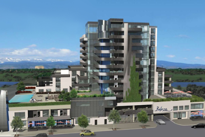
And another mid-sized version from Jetson Green - this time the Beleza: "...a LEED Certified, condo/retail project for Denver's River North ("RiNo") neighborhood. Named , a Brazilian Portuguese word for "beauty", this luxurious green community is modeled after the Brazilian city of Curitiba." Not sure how one models a building after Curitiba - so definitely some more digging to do on this one.


:: image via Jetson Green

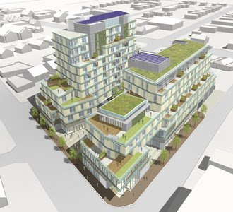
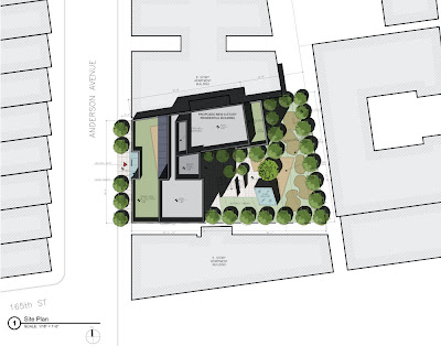
And some graphic examples from World Architecture News - the 1070 Anderson Avenue project by Magnusson Architecture and Planning which brings sustainable and affordable housing to the Bronx - including: "...numerous green initiatives, including green roofs on the 7th and 8th Floors’ setback, a generous fenestration to maximize daylight within the corridors and building envelope..."


:: images via WAN

Finally, a real example - albeit a bit odd, is the mounded grassy knoll on the Freshwater House - via Coolboom... uh, funky?


:: Freshwater House - images via Coolboom

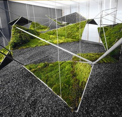
Similar to the 'Fractal Moistscape'? - via Atelier A+D...


:: image via Atelier A+D


کدخدا

مدیر بازنشسته
All eyes on the watchtower

All eyes on the watchtower

All eyes on the watchtower


New RTA Headquarters designed by Zwarts & Jansma Architects

Zwarts & Jansma Architects won the competition for the design of the new headquarters of the Road & Transport Authority (RTA) in Dubai 2007. RTA HQ will be built in an artificial lake at Al Garhoud on Marrakech Road, adjacent to the new Ras Al Khor Bridge and neighbouring the new interchange of Rabat Road and Marrakech Road.
The site is an excellent habitat for the headquarters of an organisation responsible for traffic. RTA HQ will stand as a watchtower overlooking a landscape of infrastructure embedded by the natural beauty of the Dubai Creek and the green zone of Festival City. The crossing of waterways, highways and subways has been a key-factor in the development of both the architectural concept and the landscaping.
RTA HQ is a glass crystal with Venetian blinds. The angled surfaces of the building derive from the site. The reflection of sunlight changes the appearance of the facades during the day. The façade facing the new Ras al Khor Bridge will be covered with a grid of LED-lights: a ‘billboard’ showing images, animations or information to the flow of traffic crossing the creek.
RTA HQ will be built in an artificial lake. During office hours, different features will make the water swirl and turn, in the evening the surface will become quiet. The light-effects then take over, reflecting the building and the city's traffic. The level of the lake is slightly above that of the surrounding area. Underneath it are a publicly accessible exposition space and a congress facility.
Access to the building is provided in three different ways. The congress facility and exposition space are accessible by descending stairs that run over the full length of the northern part of the plot. Staff and employees enter the building through the car park. Taxi drivers drop off visitors on an eye-catching fly-over crossing the artificial lake, right in front of the elevators in the entrance hall.​


کدخدا

مدیر بازنشسته
Soundhouse by Careyjones and Jefferson Sheard

Soundhouse by Careyjones and Jefferson Sheard

Soundhouse by Careyjones
and Jefferson Sheard


September 24th, 2008

Careyjones architects and Jefferson Sheard Architects have completed Soundhouse, a rubber-clad music studio designed for the University of Sheffield.

“The overall aesthetic of the black rubber quilt is intended as a literal translation of the need to acoustically contain the building’s use,” explains Mike Harris of Careyjones.

The three-storey building is covered with four 14 x 8 m rubber sheets, each weighing half a ton.

The sheets were stretched and fixed over the structure then decorated with stainless-steel studs, which were screwed into the reinforcement plates behind the insulation to create a quilted effect.

The following information is from Careyjones Architects:

Groundbreaking University of Sheffield building complete
The University of Sheffield’s state-of-the- art music practice and studio facility, the Soundhouse, is now complete. The striking development, conceptually designed by careyjones architects and delivered by Jefferson Sheard Architects, is completely enveloped in black rubber – a technique never seen before in the UK.
Covering 450sq m and is three storeys in height, the building’s unique black cube structure is set to become a landmark on the university campus, the bold and simple design reflecting the existing inventiveness of the Portobello area.
Professor Keith Burnett, Vice-Chancellor of the University of Sheffield, said: “The Soundhouse is the first building to be completed in the second phase of our development of the Jessop site, with the first phase seeing the completion of the Sheffield Bioincubator. The unique state-of-the- art Soundhouse is an innovative addition to the campus and will allow our students to nurture and develop their passion for music in a modern and creative environment.”
Mike Harris, Director at careyjones architects, said: “Working with a forward thinking client such as the University of Sheffield allowed careyjones to really push the design boundaries for the Soundhouse. The pioneering ‘music box’ design creates a stunning piece of architecture that sits well as part of the dynamic urban fabric, respecting important existing and new buildings in the surrounding area. Furthermore, the overall aesthetic of the black rubber quilt is intended as a literal translation of the need to acoustically contain the building’s use contained within. As a practice we look forward to strengthening our relationship with the University and continuing our work in Sheffield.”
Tom Rhys Jones, Managing Director of Jefferson Sheard Architects, continues; “From the outset this project was always going to be technically challenging as it was highly innovative in terms of both the cladding and internal fit out. The building required intricate detailing at every stage; internally to meet the demanding acoustic requirements following through externally to the unique envelope of the Soundhouse using a construction method never before used in the UK.
“We believe the detailing has gone a long way to providing the University with the 21st Century flagship building which they envisaged when they approved the original design concept.”
The Soundhouse was constructed by Kier.
Technical note:
The use of rubberised tanking as an exposed external membrane has never before been undertaken here in the UK.
Such an innovative design solution to the external envelope of a building was a huge technical challenge to the designers, main contractor Kier Northern and the supply chain partners.
One key aspect was the off-site vulcanising of the rubber sheets, which involved welding 1500mm-wide sheets together to form a single homogenous sheet, with dimensions of 14m x 8m. There were to be four in total, one for each elevation of the building. Each sheet weighed half a ton and a safe system of works was devised for their installation and final fix to the external structure.
The rubber membrane was placed under tension similar to the skin on a drum, fixed and then decorated with 100mm diameter stainless steel studs. These studs were adjustable and could be screwed back to the reinforcing plates behind the insulation and rubber quilt, thus compressing the insulation and creating the quilted effect.
Acoustic treatments
To satisfy the stringent acoustic requirements, the Soundhouse’s frame was subjected to a number of treatments. The use of dense, double skin blockwork with high specification insulation was the main strategy to reduce the effects of external noise. All connections of the building fabric to the frame had to be acoustically isolated to maintain the acoustics.
These works involved exhaustive detailing and physical on-site inspections through the quality management system. The building was then subjected to stringent on-site acoustic testing by two separate teams of acousticians.​
 

کدخدا

مدیر بازنشسته
new .. Symbiotic Villa by Zaha Hadid

new .. Symbiotic Villa by Zaha Hadid

new .. Symbiotic Villa by Zaha Hadid

September 17th, 2008

Venice Architecture Biennale: here are some images of Symbiotic Villa, a house designed by Zaha Hadid for the Next-Gene 20 project in Taiwan.


The project has invited ten international architects and ten Taiwanese architects to design houses. More info and images in our earlier story.

The project was launched in Venice last week during the architecture biennale.


کدخدا

مدیر بازنشسته
Next-Gene 20 by various architects

Next-Gene 20 by various architects

Next-Gene 20 by various architects

September 12th, 2008

Venice Architecture Biennale: twenty architects including Kengo Kuma (above and below), MVRDV, Julien de Smedt and Graft are designing villas for Next-Gene 20 - a residential development on the north-eastern coast of Taiwan.

The project, which involves ten international architects and ten Korean architects, was launched at the Venice Architecture Biennale yesterday. Top two images: Aimai House by Kengo Kuma.

Above and below: Observer by MVRDV.

A video by Squint/Opera introducing all 20 villas can be seen here.

Above and below: Shell Under Copious Rain by Graft.

We’ll publish more of the designs over the next few days.

Above and below: The Twirl House by Julien de Smedt.

Here’s some info about Next-Gene 20:

The NEXT-GENE20 is about to turn into reality. The official international presentation ceremony, which will be held in Venice during the 11th International Architecture Exhibition - La Biennale di Venezia Out There: Architecture Beyond Building directed by Aaron Betsky, will show the outcomes of the wide program of architectural experimentation coordinated by Yu-Tung Liu. All 20 projects which will soon be realized in the Northeast Coast National Scenic Area in Taiwan will be presented.

The 11th International Architecture Exhibition - La Biennale di Venezia will host the exhibition dedicated to NEXT-GENE20 in a collateral event which will be held close to the entrance to the Arsenale (Campo della Tana, Castello 2126/A - commissioner: Paolo De Grandis, Arte
Communications). A text by Aaron Betsky, director of the Venice Architecture Biennale, discloses some thoughts on the project.
As a preview for the press there is a video that will present NEXT-GENE20 to the audience of the Venice Biennale. The video, realized by Squint/Opera in collaboration with iMage, ironically introduces the project borrowing from the language of comic books and presenting the twenty architects as superheroes.
The NEXT-GENE20 project will be officially presented to an international audience during the 11th International Architecture Exhibition - La Biennale di Venezia Out There: Architecture Beyond Building directed by Aaron Betsky. All of its protagonists will be present: the initiator of the project Tai-Nien Lu, the coordinator Yu-Tung Liu, the twenty architects. They will celebrate the results of the initiative which is aimed at defining the scenario for the realization of 20 villas in the beautiful Northeast Coast National Scenic Area in Taiwan.
Such a cohesive group participation will once again confirm and acclaim the success of NEXT-GENE20, a project which has already made a name for itself and that will have everyone talk about it still for a long time.
The presence of the project as part of the forthcoming International Exhibition of Architecture at the Venice Biennale is the first and most important occasion to go deeper into the project. From September 14 until November 23, the NEXT-GENE20 exhibition will be in Venice to present the project’s results and expectations.
A wide display of drawings, sketches, renderings and models will re-enact, for the audience of the La Biennale di Venezia, the scenario where the construction site of one of the most lively architectural projects in recent times will soon start.
The houses designed by the 20 invited architects (10 international, 10 from Taiwan) will be presented. Zaha Hadid has also been invited to contribute to the NEXT-GENE20 project by designing a residence (”Symbiotic Villa”) and a building for public use (”Next-Gene Architecture Museum.”).​
 

کدخدا

مدیر بازنشسته
Heineken The City by Tjep

Heineken The City by Tjep

Heineken The City by Tjep.

August 22, 2008

Dutch designers Tjep. have created the interior of Heineken The City, a new brand store in Amsterdam, the Netherlands, which opened last month.

The store comprises six buildings and includes a clothing shop, beer shop, music recording studio for young musicians and a ticket centre for events and trips organised by Heineken.

The interior incorporates a three-storey refrigerator and logo made from ice.

The designers claim that the store is the first in Europe where all lighting is LED-based.

More stories about Tjep. on Dezeen:
Pluk
Restaurant Praq
ROC Apeldoorn reception area

Fabbrica
Waater bottle
ROC Apeldoorn interior

The following information is from Tjep.:

Heineken: The City
What do you do when Heineken asks you to design their first shop? Do you place furniture and displays into a given space? We thought it would be rather more appropriate to pour furniture into the six monumental buildings located in the heart of Amsterdam, as if we were filling a cold fresh glass of Xtra cold Heineken.

This concept translates into displays that evolve seamlessly from the floors to the walls and ceilings in abstract dynamic wave movements. The idea of coldness is consequently applied through the whole shop design including the lighting which is 100% LED based (the first in Europe).

You will also find a three story high fridge (possibly another record) containing all the Heineken bottles from different markets around the world. Alongside the fridge an ice crystal evolves along the wall containing over 600 Heineken bottles.

When you enter the shop you feel a cool breeze coming from the logo written in real ice on a metal wall (yet another a novelty). The central space features a monumental glass staircase, the material choice throughout the shop constantly supporting a sense of coolness. The floors are made of a new product developed by Senso which features an abstract graphic representation of ice cracks and a large watermark. The cashing desks are sculptural crystal shapes.

The shop is devised in four sections:

  • The fashion department featuring specially designed clothing by cutting edge fashion designers, Daryl van Wouw being the first to create a collection.
  • The ultimate beer shop featuring ‘The fridge’.
  • A fully equipped recording studio for young music artists: Refreshing Sounds Studio.
  • A tickets and travel section for trips and events sponsored by Heineken.
Information from Heineken:
Heineken is to add a new dimension to its marketing by opening a unique, ultramodern concept store: Heineken The City.

Launching July the 5th in the brewer’s home city of Amsterdam, the store comprises of six buildings where special products and services will be sold in the sphere of music, fashion, travel & events and, obviously, beer.

Marketing manager of Heineken Netherlands Herwin van den Berg, said, “Heineken The City is not a catering establishment but a concept store that stimulates all senses and where real Heineken ‘wanna-haves’ are for sale.

“We literally want to bring ‘Heineken - Serving the planet’ to life with this store. With beautiful products and exclusive services the Heineken brand makes life just that little bit more pleasant.”

The design of Heineken The City claims to be “revolutionary” , full of the latest technical devices, including speaking mirrors, 3D TV screens, an ice wall and interactive pillars. This store is the first in Europe to be 100% LED-lit.
Products and services available in Heineken The City are divided into four cornerstones: Refreshing Sounds Studio (music), Fashion, Tickets & Travel (for trips and events) and a Beer Shop (selling beer-related products).
Highlights include limited edition sneakers, special beer bottles from Asia, the opportunity to create self-designed Heineken bottles, or book a fashion tour of Amsterdam.
Heineken The City targets Dutch consumers and will be open seven days a week.​
Size: 250 m2
 

کدخدا

مدیر بازنشسته
Young Danes seal Art Plaza bid

Young Danes seal Art Plaza bid

Young Danes seal Art Plaza bid
Friday 13 Jun 2008


SEA and EFFEKT architect firms win first prize for Academy of Arts building in Estonia

Art Plaza, by the two young Danish architect firms SEA and EFFEKT, has been awarded 1st prize in the international competition for the new Academy of Arts building in Tallinn, Estonia.
The new academy building is situated in the heart of Tallinn. The building contains facilities for the departments of art, architecture, design, and art history. In addition to the academic programme the project includes a library, gallery, shop, conference facilities and a public plaza. The competition had 96 entries from 26 countries.
The jury said:
"The Jury voted Art Plaza as the winner of the competition because it is by far the best proposal when it comes to architectural concept, outer qualities and inner life. The project is stunningly simple and at the same time fascinatingly complex.
"The outer shape is a beautifully proportioned square tower. Tallinn’s downtown is dominated by visually “noisy” buildings screaming to each other. In this chaos Art Plaza suggests erecting a quiet, calm and perfect tower with only half the footprint of the site, liberating a 4000m2 plaza in the heart of Tallinn. This plaza will stand out as a unique place in downtown Tallinn, filled with students and art. Art plaza will become the new living room of Tallinn.
"The heart of the building is a spiral void. The corkscrew movement connects the entire building and creates 4 public plazas with stunning views of the entire city. The sky plazas open up the building from within, creating an art academy in constant dialog with the city - a modern open academy, which interacts with society and the world.
"The project has potential of becoming an international masterpiece, the beckon of Estonia, attracting people from all over the world to see the art academy of the future – a calm sculpture in the roar of downtown Tallinn."
Art_Plaza is an equal cooperation between the two Danish architecture firms SEA and EFFEKT.​
 

کدخدا

مدیر بازنشسته
Blue Skies

Blue Skies

Blue Skies

How drab the city streets can be with the monotone colored buildings and not much blue sky to be seen. However, after two and a half years of planning, design and construction, the Big Apple can now see blue, thanks to architect Bernard Tschumi’s Blue residential tower located on the Lower East Side. Designed with an original envelope pattern sets the structure apart from surrounding buildings, thus adding a bit of an eclectic attitude to a normally dreary skyline. With a mosaic façade that reflects the surrounding city, while blending into the sky above, are evidence to Tschumi’s attention to detail in his designing of the building. Each of the residential interiors is simple, yet elegant in design, with bamboo or palm flooring, stone counters and tile, stainless steel appliances and cabinets.
Architect: Bernard Tschumi


کدخدا

مدیر بازنشسته
A model for mixed-use in Miami

A model for mixed-use in Miami

A model for mixed-use in Miami


Dramatic and vibrant addition to Miami’s skyline

Striking in its formal imagery, KPF's Espirito Santo Plaza provides a model for mixed-use, high-rise development with a variety of amenities. The tower is arranged with offices and retail at the lower level, residential above, and a hotel at the highest level.
The building makes a strong urban statement to the street; its concave western façade embraces a new landscaped forecourt with a reflecting pool and forms a 30-storey arch which gives the development its distinctive character.
To effectively address building user groups, two distinct entry sequences were developed. At the ground floor level, a main lobby fronting Bickell Avenue serves as the primary point of entry for the office and retail components.
To the rear of the tower, an entrance one storey above grade serves the hotel guests and residents. A large glass-bottom pool allows sunlight to filter down to the vehicular drop-off at grade. Express lifts lead to an eleven-storey sky lobby rising from the 25th floor. This lobby acts as a unifying element, welcoming the occupants and offering dramatic views of Biscayne Bay.​


کدخدا

مدیر بازنشسته
Zenith music hall by Massimiliano and Doriana Fuksas

Zenith music hall by Massimiliano and Doriana Fuksas

Zenith music hall by Massimiliano
and Doriana Fuksas


June 26th, 2008​
Zenith music hall by architects Massimiliano and Doriana Fuksas has opened in Strasbourg, France.​
The interior and exterior of the structure are covered with translucent, orange fabric so the building appears solid in daylight but reveals its internal structure when illuminated at night.​
The hall seats 10,000. Projections on the textile skin act as advertisements for current performances.​
Photographs by Philippe Ruault.​
The following information is from the architects:​
–​
By its playful form and character, the Zenith music hall contributes to the great Varietee Theaters which were built since the Zenith building in Paris was erected in 1984.​
The new Zenith building is an important project for the exhibition area in Strasbourg. It will be the new attraction which will give new impulse to the future development of the city’s infrastructure.​
The concept of the design is based on a modular and a well balanced organization of the different elements: good views for all spectators, best acoustics and an optimized cost management already addressed during the concept phase of the design. The Zenith music hall provides ideal facilities for the guests and the artist performing.​
The building is to be understood as a single, unifying and autonomous sculpture. By layering and rotating the ellipsoid metal façade structure, the design receives a very dynamic character.​
This is underlined with the translucent textile membrane, which covers the steel-frame and creates magnificent light effects.​
These orange membranes also cover the volume of the music hall itself.​
This is the heart of the building: a totally enclosed and protected space, which creates a special theatre atmosphere.​
Projections on the outer skin create playful effects and convert the façade into a huge billboard communicating with the passers-by for upcoming events.​
The building’s appearance exposed to daylight is of a monolithic calmness that mutates at dawn.​
The inner experience is transmitted to the outside through the transparent skin: the whole building becomes a “light sculpture”.​
Massimiliano and Doriana Fuksas
Musichall / 2003-2007
Client: Communitée urban de Strasbourg (S.E.R.S.) / Contact: Herr Husson Area:14.000 qm , 12.000 Seats
Internationale Competition, winning project
Accustik-planer: Altia-Acoustique​
 

کدخدا

مدیر بازنشسته
Walter Towers by BIG

Walter Towers by BIG

Walter Towers by BIG

September 30th, 2008​
Danish architects and designers Bjarke Ingels Group have unveiled their design for a tower on the Walter site in Prague, Czech Republic.

The building will be a combination of office and residential spaces.

“What will appear as four different towers is actually one continuous building that is sliced up and pulled apart to maximize the amount of surface and facade area to create attractive apartments,” say the architects.

The following information is from BIG:

Prague – The Golden City… The City of Hundred Towers…
How can you build a modern tower in this great line of beautiful towers that has become the trademark of Prague? Is it possible to build a tower that fits in the historical framework and the architectural tradition of Prague and at the same time create an image that is so powerful that the tower can become an icon or landmark of the Walter site?

By uniting the tradition of building towers in clusters, which is seen in the old Prague, with the rational way of organizing tall buildings as we know it from the American skyscraper, it is possible to make a new kind of contemporary tower that unites history, functionality and the need for a new Walter site landmark.

What will appear as 4 different towers is actually one continuous building that is sliced up and pulled apart to maximize the amount of surface and facade area to create attractive apartments.

A series of manipulations of the slab is turning an ordinary apartment slab into a series of towers.

By twisting the building, it is “opened up” towards its surroundings - letting in people and light.

W CREDIT LIST
Partner-in-Charge: Bjarke Ingels
Project Architect: Niels Lund Petersen
Projekt team: Jan Magasanik, Kamil Szoltysek
PROJECT : Walter Towers
TYPE : Competition 1st prize
SIZE : 38.000m2
CLIENT : Red Group
COLLARBORATORS : AKT
LOCATION : Prague, CZ
STATUS : Ongoing


کدخدا

مدیر بازنشسته
Russia's new Moscow

Russia's new Moscow

Russia's new Moscow?
RMJM’s ‘hanging gardens’ get the green light in Ekaterinburg

As Russia's third largest city with 1.3 million people, Ekaterinburg should expect a higher profile. Yet the city has flown under the radar since it was founded in 1723, until now. Capital of the vast Ural region on the edge of Siberia, Ekaterinburg is currently enjoying an unprecedented level of investment. As the city aims to become a regional business hub on a par with Moscow, an international design competition for a new landmark development in the city has been won by an international alliance and is set to raise the city's profile.​
Russian developer Vector-Stroy, French holding Vinci Construction Grands Projets and UK-based international architectural firm RMJM will collaborate on 'hanging gardens', a mixed-use development including 46,000 sq m of serviced apartments, an international standard five star hotel and the world’s first vertical park which will run through the core of the proposed building.​
Forming the heart of a new arts, culture and sports quarter on the banks of the river Iset, the arched form of the proposed 100 metre structure echoes the poetic curves of the city’s Byzantine Temple of Blood. And behind the glass and steel exterior of the tower will lie a vertical, hanging evergreen park running through the atrium at the heart of the building. Designed with access for the general public as well as those who live and work in the building the park is thought to be the first of its kind in the world.
Matt Cartwright, director of RMJM, the architects behind the scheme, explains the thinking behind the unusual idea: “Like many cities in Russia, extreme climates in summer and winter prohibit many people from enjoying public parks and spaces. We decided to bring the outdoors inside and provide the public with a park they can enjoy year round.
“Ekaterinburg is a city steeped in tradition but which also has a bright future ahead. This new development heralds the start of a new era and signals the investment being made to return Ekaterinburg to the great city it once was.”
The design team explored ways of reducing the energy consumption of the building and it is expected that this development will become a new environmental benchmark for the city. The atrium, for example, will also act as thermal buffer zone to control the building’s temperature.
The vertical park is topped by a public sky park at the building’s pinnacle offering panoramic views of Ekaterinburg and beyond


کدخدا

مدیر بازنشسته
Coop go large in Korea

Coop go large in Korea

Coop go large in Korea
Austrian firm Coop Himmelb(l)au to break ground on first Korean project and second largest design to date

Busan Cinema Centre represents a milestone for Austrian firm Coop Himmelb(l)au as the first project in Korea and their second largest ever undertaking. Hur Nam-sik, Mayor of the City of Busan, Yu In-Chon, Minister of Culture, Sports and Tourism in South Korea and Wolf D. Prix, Design Principal and co-founder of Coop Himmelb(l)au will celebrate the groundbreaking of the entertainment centre tomorrow.
The foundation stone laying ceremony will take place concurrently with the opening of the 13th International Film Festival in the City of Busan.
Commissioned in 2005, the design features an 85 meter roof cantilever which will create a multimedia public urban space.
“The roof as signature and symbol for activity has been one of the topics our team has been working on for the past years”, says Wolf D. Prix. “Our architectural aim to defy gravity reached a new turning point by designing one of the biggest roof cantilevers in our design history which actually never touches the ground – the connection emerges only by the rise of the landscape”.
The roof appears as if it was a cloud hovering above the centre creating a vibrant landmark and protecting a vast 4,000 seat outdoor cinema and event space. The project will also include studios, offices, creative space and a convention center for the Pusan International Film Festival (PIFF). A 1,000 seat multi-functional musical, performance, concert and cinema theater is at the heart of a 4-screen specialized “CineMountain” which acts as a commercial theater and cinema center during non-festival times.


کدخدا

مدیر بازنشسته
Spikvoorde II by René van Zuuk Architekten

Spikvoorde II by René van Zuuk Architekten

Spikvoorde II by
René van Zuuk Architekten


October 1st, 2008

Dutch architects René van Zuuk Architekten have completed Spikvoorde II, a building containing a school and apartments in Deventer, Netherlands.

A primary school occupies the first three floors of the building, with nine private apartments on the upper floors. All photos are copyright Christian Richters except where specified.

The following is from René van Zuuk Architekten:

Spikvoorde II
Spikvoorde is a part of “De Vijfhoek” (The Pentagon), a new neighborhood in the city of Deventer in The Netherlands.

The project is situated in a very prominent location in this area, just across a T-junction which offers a view to all directions.

This distinct location calls for a vertical beacon that acts as a reference point within the neighborhood

Therefore the building has been split in segments that accentuate this vertical effect, which becomes even stronger when reflected in the water when seen from the entrance way. The segments itself are horizontally split to create balance in the facade.

The first segment is aligned with the entrance road. This volume get repeated two times by rotation.

The complete configuration curves along with the road that runs next to the water, creating a complex system to the eye but that is highly repetitive in building structure (floor and facade parts). Above image: copyright René van Zuuk Architekten

The north side is different; here the partly underground building follows the adjoining road.
Abov image: copyright René van Zuuk Architekten

On this side the entrance to primary school, which will occupy the first three floors, has been placed.

Next to their entrance a raised playground tops an extension that hides the school’s offices.


کدخدا

مدیر بازنشسته
California Academy of Sciences by Renzo Piano Building Workshop

California Academy of Sciences by Renzo Piano Building Workshop

California Academy of Sciences by
Renzo Piano Building Workshop


October 3rd, 2008​
California Academy of Sciences by architects Renzo Piano Building Workshop opened last week in Golden Gate Park, San Francisco.

The museum, which contains an aquarium, a planetarium, a natural history museum and research and educational facilities, features a “green” roof and numerous sustainable features.

The following information is from California Academy of Sciences:

NEW CALIFORNIA ACADEMY OF SCIENCES RECONCEIVES TRADITIONAL SCIENCE MUSEUM; OPENS SEPTEMBER 27 IN GOLDEN GATE PARK

Record-setting “green” building designed by Renzo Piano houses an aquarium, planetarium, natural history museum, and world-class research facility—all under one living roof

SAN FRANCISCO (September 18, 2008) — One of the world’s most innovative museum building programs—a record-setting, sustainable new home for the California Academy of Sciences—has reached completion in San Francisco’s Golden Gate Park.

After nearly a decade of planning and the largest cultural fundraising effort in San Francisco history, the new Academy will open to the public on September 27. Designed by Pritzker Prize winner Renzo Piano, the new building stands as an embodiment of the Academy’s mission to explore, explain and protect the natural world. Expected to earn a LEED Platinum certification from the U.S. Green Building Council, the new Academy is topped with a 2.5-acre living roof and employs a wide range of energy-saving materials and technologies.

The California Academy of Sciences is one of the world’s preeminent natural history museums and is an international leader in scientific research about the natural world. Founded in 1853 as the first scientific institution in the West, it is the only institution in the world to house an aquarium, planetarium, natural history museum, and world-class research and education programs under one roof. This major new initiative builds on the Academy’s distinguished history and deepens its commitment to advancing scientific literacy, engaging the public, and documenting and conserving Earth’s natural resources.

“Science is more influential and relevant to our daily lives than ever before, and natural history museums can and must deal head-on with the issues of the 21st century,” said Academy Executive Director Dr. Gregory Farrington. “Our goal was to create a new facility that would not only hold powerful exhibits but serve as one itself, inspiring visitors to conserve natural resources and help sustain the diversity of life on Earth.”

Design Driven by Nature
The Renzo Piano Building Workshop, in collaboration with local firm Stantec Architecture (formerly Chong Partners), worked with the Academy to create a design that grows out of the institution’s mission, history, and setting. The new design unifies the Academy’s original array of twelve buildings, which were built over eight decades, into a single modern landmark that places a visual and intellectual emphasis on the natural world.

“With the new Academy, we are creating a museum that is visually and functionally linked to its natural surroundings, metaphorically lifting up a piece of the park and putting a building underneath,” says architect Renzo Piano. “We are excited to collaborate with the Academy on a project in which design and mission are so seamlessly integrated. Through sustainable architecture and innovative design we are adding a vital new element to Golden Gate Park and expressing the Academy’s dedication to environmental responsibility.”

Piano’s goal was to create a sense of transparency and connectedness between the building and the park through both a careful selection of materials and a thoughtful arrangement of space. Glass is used extensively in the exterior walls, allowing visitors to look through the museum to the surrounding green space of the park along both the east-west axis and the north-south axis of the building.

The glass, which is manufactured in Germany, is famous for its especially clear composition. To enhance the open, airy feeling created by the glass, Piano designed the central support columns to be extremely slender. A series of carefully configured cables prevent these slim columns from bending. The concrete for the walls and floors will remain untreated, continuing the emphasis on natural materials.

“Museums are not usually transparent,” says Piano. “They are opaque, they are closed. They are like a kingdom of darkness, and you are trapped inside. You don’t see where you are. But here we are building a natural history museum in the middle of a park, and those are two things that should belong to each other. They should be as connected as possible.”
The building is topped by a colorful living roof—a 2.5 acre expanse of native California plants and wildflowers that creates a new link in the ecological corridor for wildlife. Steep undulations in the roofline roll over the Academy’s domed planetarium, rainforest, and aquarium exhibits, echoing the topography of the building’s setting and evoking the interdependence of biological and earth systems.
The new Academy site is located directly across from the new de Young museum, which opened in October 2005 and was designed by Swiss architects Herzog & de Meuron. The architectural dialogue between the two buildings and their unique responses to the environment of Golden Gate Park furthers San Francisco’s growing role in supporting groundbreaking architecture and design.
Setting a New Standard for Sustainable Architecture
The new Academy is one of ten pilot “green building” projects of the San Francisco Department of the Environment, part of a vanguard initiative to develop models for workable, sustainable public architecture. Designed to be the greenest museum in the world, the new Academy optimizes the use of resources, minimizes environmental impacts, and serves as an educational model by demonstrating how humans can live and work in environmentally-responsible ways. The new facility integrates architecture and landscape, and helps to set a new standard for energy efficiency and environmentally responsible engineering systems in a public, architecturally distinguished building.
In Piano’s design, the environmentally sensitive components of the building are featured, rather than hidden. The living roof, which reduces storm water runoff by up to 3.6 million gallons of water per year, includes an observation deck, allowing visitors to admire the rooftop wildlife haven and learn about the benefits of this sustainable feature. The roof is bordered by a glass canopy containing nearly 60,000 photo voltaic cells, which will produce up to 10 percent of the Academy’s annual energy needs.
These photo voltaic cells are clearly visible in the glass canopy, providing both shade and visual interest for the visitors below. Additional green features throughout the building are highlighted with informational signage. There are varying shades of green as measured by the U.S. Green Building Council through its LEED™ (Leadership in Energy and Environmental Design) rating system.
The LEED rating system is a voluntary, consensus-based national standard for evaluating high-performance, sustainable buildings. Through all aspects of design and construction, the Academy will strive to achieve the highest possible rating: LEED platinum. The Academy’s rating is expected to be awarded by the end of 2008.
In recognition of this commitment to sustainable “green” design, the Academy project was selected as the North American winner of the silver Holcim Award for Sustainable Construction in September 2005. The competition, organized by the Holcim Foundation for Sustainable Construction in collaboration with five of the world’s leading technical universities, promotes sustainable approaches to the built environment.
The Academy was also awarded the EPA’s regional 2006 Environmental Award in recognition of the new building’s sustainable design. The EPA received more than 160 nominations in 2006; the Academy of Sciences was one of 39 recipients to be selected in this very elite group of environmental champions.​
 

کدخدا

مدیر بازنشسته
Olympic canoe centre gets go-ahead

Olympic canoe centre gets go-ahead

Olympic canoe centre gets go-ahead
London 2012 canoe / kayak slalom venue gets planning green light

London 2012 Olympic plans have been strengthened this week by the planning approval for the White Water Canoe Centre at Broxbourne. The Centre will be retained as a legacy sporting and leisure attraction following the Olympics. Following Broxbourne Borough Council's approval, the plans will now be referred to the Government Office for the East of England to grant planning permission.​
The White Water Canoe Centre will be built by the Olympic Delivery Authority (ODA) in Broxbourne, Hertfordshire to host the canoe / kayak slalom events during the Olympic Games in 2012. After the Games, the venue will be developed to become a sporting and leisure facility for canoeing and white-water rafting, as well as a major competition venue for elite events. The Centre will be owned and managed by Lee Valley Regional Park Authority, and will sit alongside the existing centres of sporting excellence in the Lee Valley Regional Park.​
A planning application for the White Water Canoe Centre was submitted in the summer following public consultation with local residents on the venue plans. Broxbourne Borough Council on Tuesday night granted planning approval allowing the plans to go to the Government Office for the East of England to grant planning permission. The venue plans include:
- An international standard Canoe / Kayak Slalom Course – an Olympic standard 300m course, with a warm-up course and finish lake. A new artificial water body will be constructed and the white-water will be created through a system of pumps
- New parklands - the canoe course will be located within a wider parkland setting. The landscaping works will include path and bridge networks throughout the venue to facilitate spectator access and viewing
- A new facility building – containing a reception, café, changing rooms, shop, offices, spectator viewing facilities, equipment storage and water pump/filtration facilities
David Higgins, ODA Chief Executive said: “Securing planning approval is a significant milestone and keeps us firmly on-track to deliver the new world-class facilities at Broxbourne in good time for the Games. Our plans for Broxbourne are a key part of spreading the benefits of the Games around the country and will help us create a major leisure attraction for Broxbourne and the East of England region for many years to come.”
 

کدخدا

مدیر بازنشسته
بنای تاریخی پله دار جهان

بنای تاریخی پله دار جهان


Chand Baori (چاند باری) عمیق ترین بنای تاریخی پله دار جهان

كه در هندوستان واقع شده است

لطفا تا باز شدن كامل عكسها شكيبا باشيد
در صورتی که هر یک از عکس ها باز نشد بر روی آن راست کلیک کرده و گزینه Show Picture را انتخاب كنيد


بالا