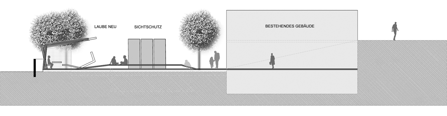
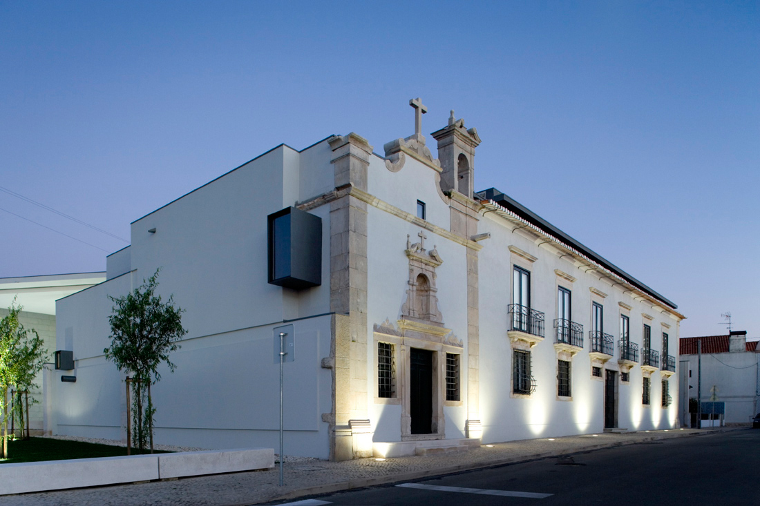
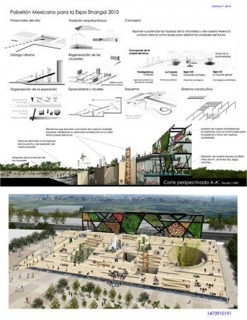
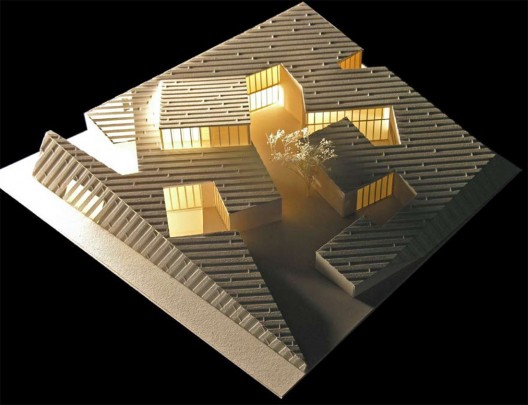
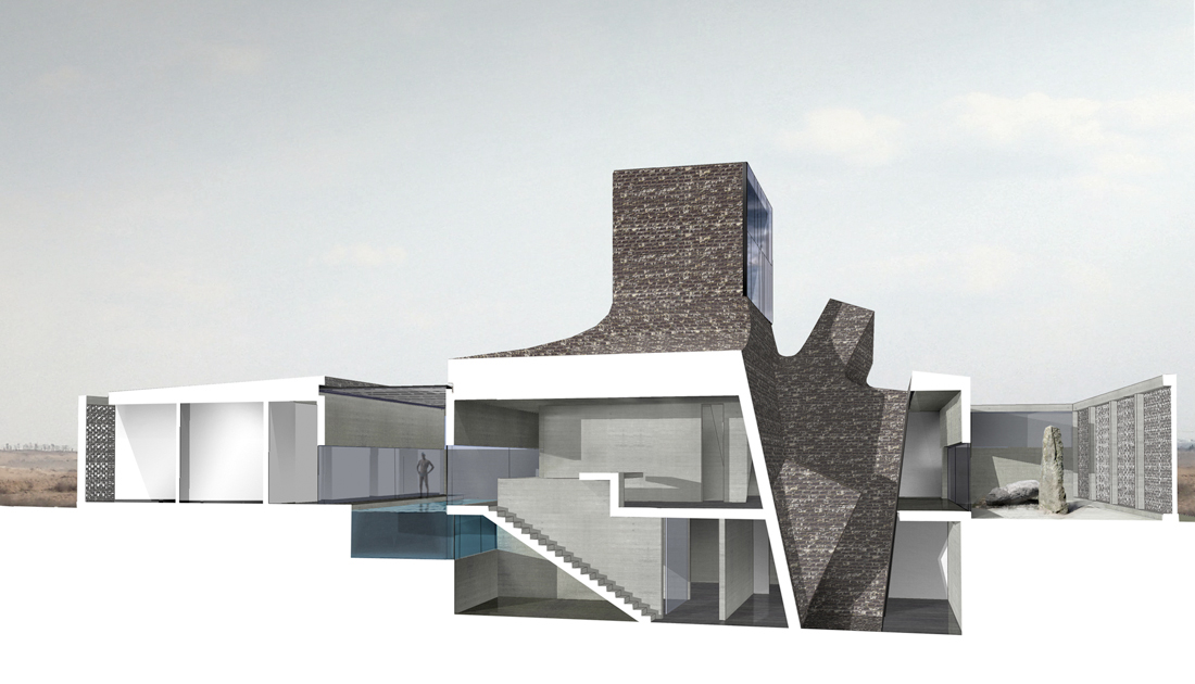
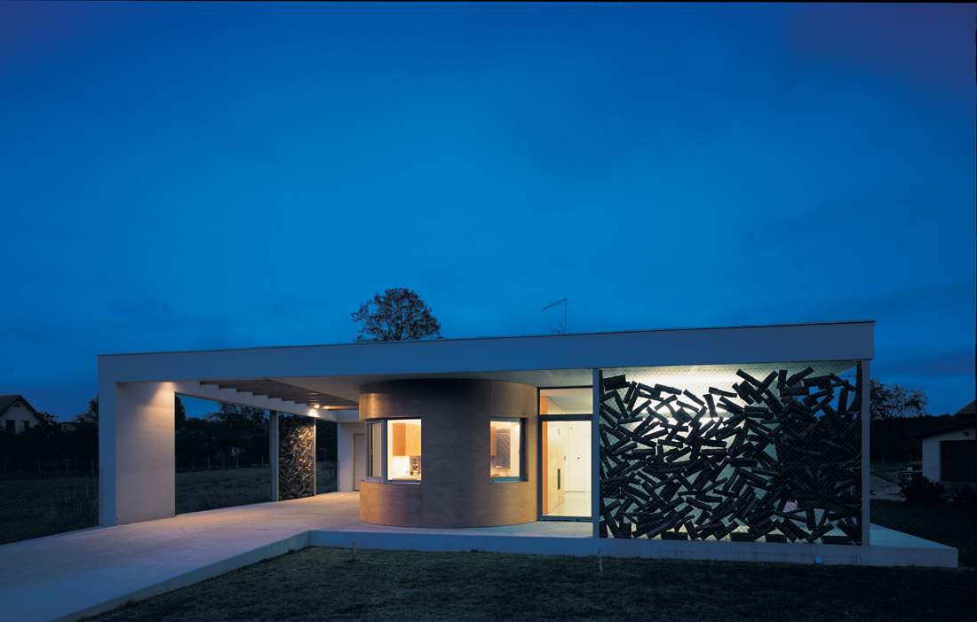
New Concepts

New Concepts

  • عالی

    رای: 126 62.4%
  • خوب

    رای: 56 27.7%
  • متوسط

    رای: 13 6.4%
  • بد

    رای: 7 3.5%

  • مجموع رای دهندگان
    202
  • نظرسنجی بسته .

کدخدا

مدیر بازنشسته
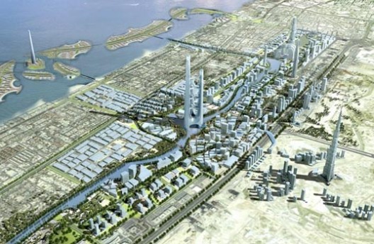
China sprouts first ever super-tall district
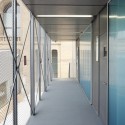
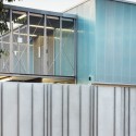
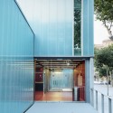
Ground breaks on third of trio of towers in Shanghai’s Luijiazui Finance and Trade Zone

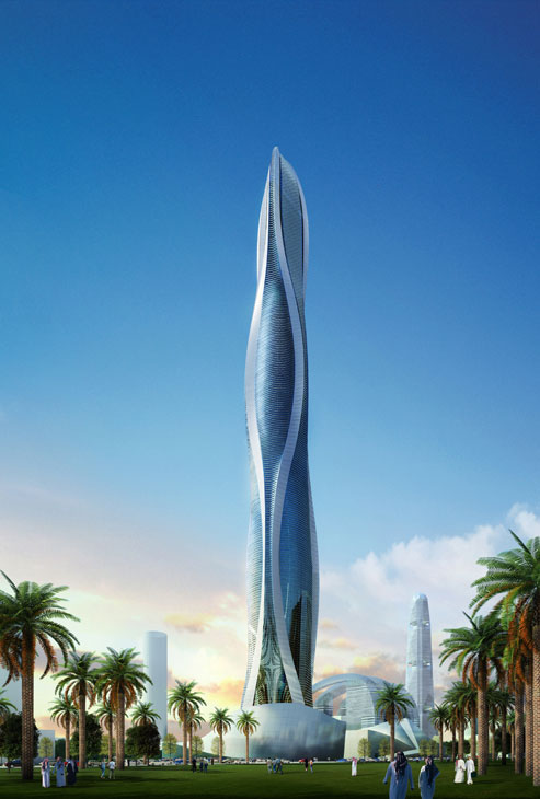
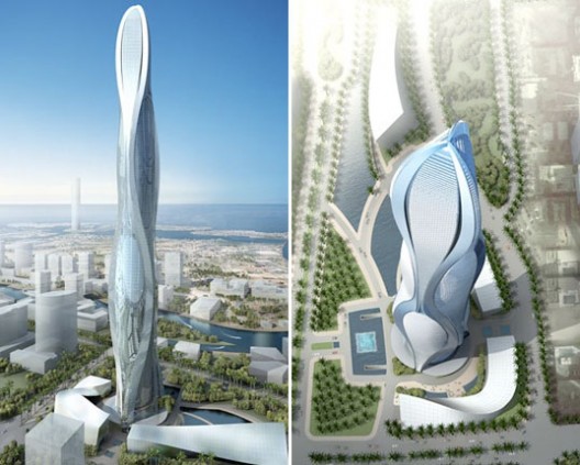
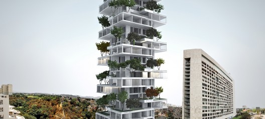
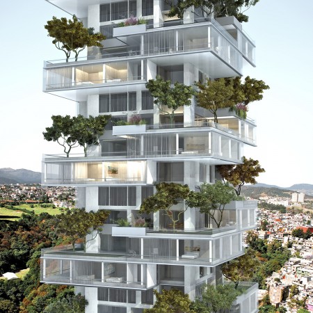
A 632 m tower designed by Gensler breaks ground today in Shanghai to complete a trio of new super-tall towers revolutionising China’s architectural record. Shanghai Tower will join and rise above the recently appraised ‘Best Tall Building Overall’ by the CTBUH, Shanghai World Financial Center and the Jin Mao Tower in the Luijiazui Finance and Trade Zone as China’s first ever super-tall district.
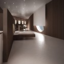
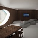
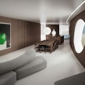
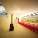
The tower, commissioned by Shanghai Tower Construction and Development Co., Ltd, will be the tallest in China with the highest open air observation deck in the world. Consisting of office space, a luxury hotel, retail and cultural venues the building will also hold connections to the Shanghai Metro and three floors of parking below ground level.
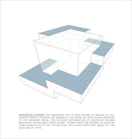
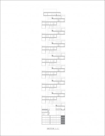
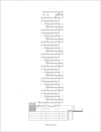
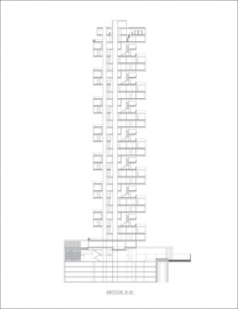
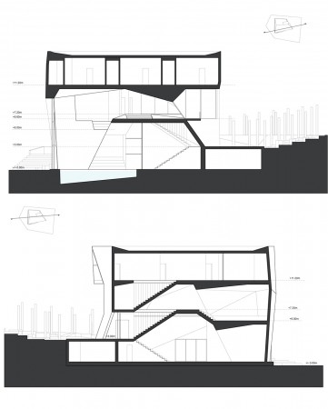
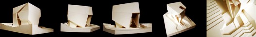
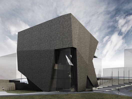
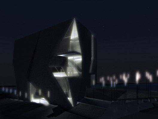
Shanghai Tower is organized as nine cylindrical buildings stacked one atop another. The inner layer of the double-skin façade encloses the stacked buildings, while a triangular exterior layer creates the second skin, or building envelope, which gently rotates as it rises. The spaces between the two façade layers create nine atrium sky gardens.
“This tower is symbolic of a nation whose future is filled with limitless opportunities,” said Qingwei Kong, President of Shanghai Tower Construction & Development Co., Ltd. “With Shanghai Tower we celebrate not only China’s economic success and increasing connection to the global community, but also our company’s commitment to developing properties that demonstrate the highest, noblest and most exquisite design achievements possible.”


کدخدا

مدیر بازنشسته

کدخدا

مدیر بازنشسته
در ضمن هیچ قصد جسارت به دوستمون اقای کدخدا ندارم چون شما گفتی تاپیکNew Concepts با ارزش هست اختلاف ما همیجاشس که شما همچین تاپیکی رو با ارزش میدونی ولی من نه . تمام مطالب این تاپیک به راحتی میتونم تو سایت arcspace پیدا کنم . کپی کردن یک سری مطالب اونهم حتی ترجمه نشده چه ارزشی داره ! ایا همه مثل من و شما زبانشون خوبه که بتونن مطالب رو بخونن ؟ اگه حداقل با ترجمه می بود ارزش داشت . هر کس نظری داری . اینم نظر منه .
کاش یکی زود تر این حرف زده بود.
اول همه ما هر اطلاعاتی رو بخوایم می تونیم توی اینترنت پیدا کنیم پس چرا می ریم دانشگاه؟برا اینکه یه سری اطلاعات رو دسته بندی شده به ما می دن و یاد می گیریم ما هم دسته بندی کنیم و حتی برای فکر کردنمونم ساختار داشته باشیم.
خب من یه سری توضیح راجب این تاپیک بدم چون بالاخره ایجاد کننده این تاپیک منم.
این تاپیک دقیقا به همین خاطر که همه ما زبانمون خوب نیست ولی باید باشه به زبان اصلیه و حتی اگه دقت کرده باشین به تک و توک به زبان عربی هم توش پیدا می شه.علت ایجادش هم این بوده که که از بین تمامی کار هایی که شما توی arcspace پیدا می شه تعدادیش اینجاست و نه همش اینکه چرا اینها انتخاب شدن به ذهنیت من که شروع کننده هستم ربط داره.
نکته دوم این تاپیک فقط از سایت arcspace نیست هر مطلبی هر جایی که فکر کنم به این تاپیک ربط داره رو داخلش قرار می دم.
راجب فارسی این تاپیک که می شه ایده های نو یه کار تکی نیست نیاز به همت دوستان داره که بیان و ترجمه کنن شاید یه روز تاپیک ایده های نو هم ایجاد بشه.
به هر صورت هر حرفی هر جا زده بشه یه سری منتقد داره و یه سری مشوق خوشحال می شدم به جای پست توی مدیریت باشگاه اینجا انتقاداتونو بگین
مرسی
سعید
 

کدخدا

مدیر بازنشسته
Jumeirah Gardens / SOM & Adrian Smith + Gordon Gill Architecture

Jumeirah Gardens / SOM & Adrian Smith + Gordon Gill Architecture

Jumeirah Gardens / SOM & Adrian Smith + Gordon Gill Architecture

31Oct 2008​

UPDATE: We wrongly credited the whole project to AS+GG, but they were only comissioned to design the three main towers, on a master plan designed by SOM Chicago.

It seems no one told Dubai about the financial crisis, as new projects keep being unveiled. This time, our green friends over Inhabitat tipped us on a mega development, owned by Maraas Holding: The Jumeirah Gardens. The master plan for this project was designed by SOM Chicago, and consists of a mixed-use development that incorporates low, medium, and high-density zones for business, residences, retail, leisure, and recreation - a city within a city, with an estimated cost of US$95 billion.

The three main towers were comissioned to Chicago based architects AS+GG (Adrian Smith + Gordon Gill), The most impressive one -and the third tallest tower in the UAE- is 1 Dubai, pictured above. The tri-partite skyscraper will be 3218 ft (981m) tall, and the towers will be connected by a series of glass suspension sky-bridges. This bridges are so big, they even grow palms on them as you can see on the further renderings. At the base of the buildings, grand arched entrances allow boats to travel underneath the building and into a central atrium space. The mixed-use development includes a hotel, residential, commercial retail and entertainment space totaling 800,000-900,000 square meters.


Next, we have Park Gate, a complex of 6 mid-rise towers facing each other to form a grand garden space and create a shaded micro climate - ad-hoc for the desert climate.

The shade is accomplished by linking the towers with a vaulted canopy structure. The space beneath the canopies is transformed into a verdant grotto. Vegetation is enmeshed with the canopies and exterior balconies of the towers, creating a highly sustainable 360 degree garden.

The result is an impressive urban hall. Each of the six towers is 30-40 stories. The development includes residential, commercial, retail, hospitality and entertainment spaces.

1 Park Avenue is a 1968ft (600m) with a fluid shape, that “[...] symbolizes Dubai’s historic relationship to water- drawing parallels to the movement of the Gulf around which the city was built and the waterways that will transport newcomers and travelers throughout the city in the future”. The mixed-use tower will have a total built-up area of 350,000 square meters.

Excavations have started, and project should be completed by 2020.
I gotta say that I´m really looking forward to visit Dubai. I need to see how this turns up with my own eyes.
 

کدخدا

مدیر بازنشسته
House Place Jordan / Heri & Salli

House Place Jordan / Heri & Salli

House Place Jordan / Heri & Salli

31Oct 2008​

The “House Place Jordan “contains structural interferences in an existing garden plant of a single family house in Klagenfurt - Viktring (Kärnten/Austria). Geometrical existing ways leading through the garden and extended in their function of ways - understood as linear surfaces of spatial possibilities - detaching, consolidating themselves, forming spatial compressions, into the earth disappearing or to the sky striving. Always co-ordinated as some kind of service to the user.
More info & photograph by Paul Ott after the break
The existing condition and the starting position

In 1997 the house Jordan in “Klagenfurt” was built after the plans of the architect Wretschko. In 1999 was added a rising plate after sketches of Tom Mayne. One receives on the one hand the feeling that the house is positioned at a hill, on the other hand distinguishes the property itself from the environment and offers protection for “an internal” so called free space.
Two geometrically linear ways through the garden open the most important places for the user.
It was a desire by the owner that the garden should remain as a “wide” existing surface.
A far field of different possibilities to use. There was a swimmingpool with a surrounding concrete area existing. Also a summerhouse was added in the following years - this should not exist any more and be cleared away.

The main goal, which should be founded in a private competition under three architects, was to create on the one hand a new lounge (summerhouse), on the other hand in addition, certain separately elements distributed over the garden - an existing ‘”view-protection” should be removed - should be brought up for a new discussion.
A new unit of not cultivated an cultivated surfaces in the garden should be achieved.​
Interferences in an existing garden

Due to the existing situation of the garden situation we tried to create and continue a kind of landscape character. The existing rather elementarily arising ways are taken up and subjected to spatial dynamics, different functions and tasks following. As simply accessible surfaces to stay around the swimming pool, as seat faces or couch surfaces, as a table….or as a roof, to offer protection or “view-protection to the neighbours.

Also the stripes should create possible positions and movements, as the garden himself should be a free area of possible movements.
In the area of the “pool-plate” six stripes line up on each other and take over different functions.
A fragmentary strip as a ramp has the task leading to the lawn. We describe this as a kind changing stripe - coming of the garden and leading into the garden -….. immersing, releasing the movement and in the area of the “view-protection” again emerging, and receiving function. Each individual strip of the “view-protection” is associated to an existing stripe, leading through the garden.
general plan​

section​
rendering 01​
rendering 02​


sketches 01​
sketches 02​
 

کدخدا

مدیر بازنشسته
Budapest City Hall by Erick van Egeraat

Budapest City Hall by Erick van Egeraat

Budapest City Hall by Erick van Egeraat

October 31st, 2008

Dutch architect Erick van Egeraat has won a competition to design a new city hall for Budapest, Hungary.

The project combines restoration of the existing 18th century building with 40,000 square metres of new construction.

The ground floor will comprise a public square, retail facilities, cafés, restaurants and a theatre to be used for conferences and exhibitions.

The upper floors will consist of rented and city offices, and a hotel. The design also incorporates access to the underground station where the old city walls are displayed.

The project is due for completion in 2012.
Here’s some more information from Erick van Egeraat:

Erick van Egeraat builds new City Hall for Budapest
Erick van Egeraat has won the international competition to design the City Hall in the centre of Budapest. From a field of 18 participants, an international professional jury selected his proposal, which combines restoration of the existing 18th century baroque building and new, futuristic wings to create a contemporary Main Square. This proposal makes an end to a period of almost three centuries of uncertainties at this unique plot in the Heart of Budapest.
In accordance with the objectives of the competition, this new City Hall, with its open courtyards and flexibility of use, will reflect transparency and democracy, will act as a Forum for the people of Budapest and will attract tourists. It will at once re-introduce pedestrian flow from the main street to the river Danube and offer a spectacular view of the city from the platform on top of the entrance gate. “This project provides a unique opportunity to both boost the economy of the city of Budapest and create an attractive new city centre for all”, says Erick van Egeraat.
Erick van Egeraat’s design is based on combining three distinct functions: culture, commerce and administration. It proposes direct access to the underground station, where the old city walls are excavated and on display. At ground floor level, the building is entirely open to the public and comprised of, among others, retail facilities, cafés and restaurants. The upper floors mainly host rentable offices, city offices and a design hotel.
The entire façade reflects the transition between old and new, between closed and open by forming a visual wall along the main street. The existing building with its closed, baroque façade is continued in a semi-open structure of organic columns, which in turn open up into a gate-like structure defining the entrance to the new complex.
The Cultural Forum is the most public space within the program and is strategically located in the centre of the complex. It incorporates a multifunctional theatre, which can be used for conference and exhibition purposes. According to Erick van Egeraat, “the Forum acts as the connection point between the past and the future, between the historical chapel space and the new building, and between the historic and the contemporary baroque to complement and emphasize each other. At the same time it interlinks all forms of culture, education, entertainment and politics.”
The new City Hall will comprise 118.000 square metres of gross floor area, 40.000 square meters of which will be newly built. The project’s completion is scheduled for 2012.​
 

کدخدا

مدیر بازنشسته
House of Astronomy by Bernhardt + Partners


Architects Bernhardt + Partners have designed an astronomy centre in Heidelberg, Germany.

Called House of Astronomy, the building will be used to give workshops and presentations about astronomy to school pupils, teachers and the public.

According to the architects, the structure is based on the shape of a spiral galaxy; offices and seminar rooms wrap around a central auditorium, which seats approximately 100 people.

Construction is due for completion in 2011

The following is from Bernhardt + Partners:

House of astronomy, Heidelberg (Germany)
The building will be used to teach pupils, teachers and the public the fascination of astronomical themes. Children and teenagers will be able to improve their basic knowledge on physics and mathematics through enthusiasm on astronomy. Workshops provide teachers with new ideas for presenting scientific subjects in the classrooms. The M51 spiral galaxy was used as the primary design key. The building geometry is derived from the galaxy core and their spiralling arms. The tracks, in which the stars, gas, dust and dark matter rotate around the centre of the galaxy, are used as snapshots and transferred into 3D curves. These 3-dimensional staggered curves form the peculiar cladding of the building.

Three curves define a strip of facade that accumulates towards the centre of the building and is separated by a band of glass. Although on first sight it seems a point- symmetrical building, both the storey levels and the façade rotate around the centre of the building. As a result of that, the galaxy will not be transferred into a 2-dimensional picture but into a full 3-dimensional structure made of orbits. The sinuous spiral arms are shifted by a half storey and thus give extra support to the buildings rotational movement around the core.
By the mean of this entresol shift, new cross-links between the levels will be created. The auditorium in the centre of the galaxy is a multifunctional room for scientific lectures and astronomical displays with an All-dome projection system existing of a 12m diameter cupola and additional inclinable chairs.

The overall 2700sqm net useable area of the building are provided through concrete slabs supported by one central cantilever that projects towards the column-free facades. This cantilever which is a mixture between a massive beam and a box girder rests on only a few central columns. Ramps will be designed to embrace the auditorium in the centre and will lead to different levels of the building. The cores of the main staircases will be designed to transfer vertical loads and work as horizontal reinforcements for the building structure.

The surrounding facade of the building, working as a support and climate shield and therefore fulfilling the main physical tasks of the building, will be elevated onto the massive concrete slabs with recognizable distance. The secondary support system of the façade takes over the load transfer of dead loads, wind and snow-forces and transfers those forces into the ceiling slabs and the massive parapets.

The construction work for the project of the Klaus-Tschira- Foundation and the Max-Planck-Society is intended to start next year. Until 2011 the building should be finished. Only the building costs are still written in the stars…
 

کدخدا

مدیر بازنشسته
Wellness Sky by 4of7

November 27th, 2008​

Belgrade-based design studio 4of7 and London-based practice Superfuisonlab have completed the conversion of a former restaurant in Belgrade, Serbia, into a gym and spa.

The former communist building is cantilevered 15 metres above the river.

Approximately 390 translucent, triangular, back-lit panels are suspended from the ceiling’s steel structure.

More information about the project on the 4of7 blog. Photography by Ana Kostic.
The following information is from 4of7:

Project: Wellness Sky
Size: 1100m2
Location: Belgrade, Serbia
Design Team: Djordje Stojanovic, Vlada Pavlovic, Slavko Milanovic
Foto credit: Ana Kostic

The building named ’Danube Flower’ was built some thirty-five years ago to become a landmark at Belgrade waterfront. It used to house an exclusive restaurant which was a segment of a larger recreational centre accessible to the public. The project was sponsored by the communist government of the time and endorsed by then ubiquitous president J.B.Tito, who was the first guest at the restaurant on November 22nd 1973.

It was a famed hangout spot until its decay in the nineties and its final closure which coincided with the start of the civil war in the country. For the period of fifteen years building was not in operation and has deteriorated considerably.

In many ways the building is particular but above all for its synthesis between architectural and structural reasoning. The main volume of the building, triangular in plan, is elevated some fifteen meters above the river and the ground level with the pedestrian esplanade. It is supported solely by the central core which contains two elevator shafts and double spiral staircase. Cantilevers are reaching out some twelve meters giving a levitating feel to the building.

In addition one more structural move is crucial for seamless interaction between exterior and interior of the building. Concrete floor-slab and ceiling shell are not connected at the perimeter of the building, allowing for the continuity of the glass façade to the full extent. Uninterrupted glass strip, with the total length of 150 meters, is wrapping around the building to give constant presence of the Danube River in the interior, with sweeping views reaching far out, both upstream and downstream.

Together with the client organization, already reputed for its high-end gym and spa in the city centre, we have formulated a project brief promoting active lifestyle. We have defined the Sky Wellness concept suggesting that place should be light and spacious so that visitors should be getting an impression of entering a cloud on arrival.

In response we have opted for reflective resin floor finishes throughout and semi translucent Barrisol stretched ceiling; both aiming to expose sleek forms of Technogym training equipment in the open plan arrangement.

Originally, building was planed on the grid of 7.3m equilateral triangles which defined its organizational and structural regularity, but with the different brief now we were looking for a change. Defining moment of the new spatial expression is the suspended.

Its design is the sequence of geometric transformations and subdivision applied to the original grid. As a result, approximately 390 backlit panels with the finite variation in shape and size are suspended from the triangular steel construction.


کدخدا

مدیر بازنشسته
House in Somosaguas / A-cero


The spanish architecture firm A-cero, directed by Joaquin Torres, has built a new house in the Madrid outskirts that synthesizes the evolution of the studio’s signature design language and its technical experimentation over the last years. The house can be aesthetically inscribed in the series of projects made by the studio since its international expansion, in places like the Dominican Republic and Dubai, presenting a greater spatial complexity and and use of shapes that underlines the relation between A-cero’s architecture and contemporary sculpture.

At first impression the house clearly shows its intentions, with the dominance of stylized curves and bold shapes that relate harmonically to its natural context while keeping a clearly modern character. The horizontal shapes pile up one on another, creating a stratified building that seems to emerge from the earth like a natural formation, the façades are treated with a texturized dark concrete, completing the mineral analogy.

In this capacity of being at once natural in its matter and artificial in its forms, the house reminds of the work of minimalist sculptors like David Nash, or a piece of land art.
The interior contains a varied program, solved with a very complex array of spaces with different heights and levels, as well as the particular shape of some of the rooms. The lower level contains the main hall -covered by a curved ceiling that accentuates its relevance-, living and dining rooms, master bedroom, gym, interior pool, kitchen and service areas. On the upper level is located a painting studio, under a long curved ceiling, flooded with natural light and the best views over the surrounding landscape. The basement is dedicated to health and leisure, with a bar, games room, chill out, massage room, projection room, cellar and gym.

The spaces are freed of columns and other elements that would alter its fluidity and openness, light materials have been used in the interior design to improve this aspect. The floors are covered with large format white ceramic tiles and the bathrooms are finished in white aluminum.


ground plan​
 

کدخدا

مدیر بازنشسته
Isle of dogs towers eastwards and upwards
The mosaic cantilevered ‘head’ building is awaiting planning permission

Making an attempt at distinction in London's Isle of Dogs, Angel House is awaiting the go-ahead to be built at the junction of Marsh Wall and Limeharbour. Designed by architect Jacobs Webber for Angel House Developments Ltd, the tower has been dubbed 'Number 1' due to it's form created by the cantilevered head. The scheme's location could swing permission in its favour as it aims to respond to an area of tall buildings such as Canary Wharf, whilst providing aesthetic distinction. The tower, however, would be the first skyscraper to branch off to the east of the Isle of Dogs.
The mixed use tower is designed to comprise roughly of 280 luxury and affordable flats; a residents-only roof top swimming pool, fitness centre and garden; ground floor restaurants with retail facilities and a pocket square for public access.
The proposed height is 42 storey plus ground with an 11 storey podium section that will contain 10 levels of affordable apartments, with all the family units being double aspect and nearly all benefiting from lounge areas with a south view. A characteristic art glass mosaic on the north and south facades added as further differentiation from nearby office buildings.
The development is relying heavily on its compliance with the Mayors Energy Hierarchy to ‘be lean’, ‘be green’ and to ‘be clean’. The design features a large landscaped garden and children’s play area surrounded by 3m high wall of safety glass with lawns, trees and a vegetable garden on the roof of the podium. Additionally all apartments will have balconies or winter gardens and will have the possibility to be naturally ventilated.
It is claimed that carbon emissions will be cut by approximately 11%, whilst a Combined Heat and Power Plant (CHP) will further decrease it by 12%. Furthermore, Biomass Boilers will provide a further 14% reduction in CO2 levels and will provide a significant proportion of the total heat and hot water needs of the building.
Tower Hamlets Council will decide the fate of the development with a planning committee meeting taking place in the near future. No objections have yet been submitted for the development.

Laura Salmi
Reporter


کدخدا

مدیر بازنشسته
Taubman Museum of Art


Photo: Timothy Hursley
Located on a prominent corner of Roanoke’s downtown, the Taubman Museum of Art creates a gateway to the city for visitors arriving from US I581. As Roanoke’s most contemporary structure, the building is also intended as a metaphorical gateway to the future as Roanoke evolves from an industrial and manufacturing economy to a technology – driven economy.

Photo: Timothy Hursley
The building’s forms and materials evoke the drama of the surrounding mountainous landscape of the Shenandoah Valley – the Blue Ridge Mountains and Appalachian Mountains – and the industrial era building culture of the early 20th century railroad boom when Roanoke came to prominence as a switchpoint city.

Photo: Timothy Hursley
The finish on the undulating, stainless steel roof forms reflects the rich variety of color found in the sky and the seasonal landscape. Inspired by mountain streams, translucent glass surfaces emerge from the building’s mass to create canopies of softly diffused light over the public spaces and gallery level. As it rises to support the stainless steel roof, a layered pattern of angular exterior walls is surfaced in shingled patinated zinc to give an earthen and aged quality to the facade.

Photo: Timothy Hursley

Photo: Timothy Hursley

Photo: Timothy Hursley
The building occupies three levels with all functions organized around a central atrium space. The glass atrium allows the lobby to be filled with natural light during the day.
At night, the translucent glass roof surfaces are illuminated, allowing the volume to glow like a beacon and draw visitors and the community to the museum’s activities.

Photo: Timothy Hursley
“Hokie” stone, native to western Virginia, is used in the lobby, store and theatre foyer, adding a familiar, natural texture and color to the interior. The variations of the forms and textures emphasize the striations, clefts and eroded rock surfaces found in the region’s famous caverns, cliffs and river gorges.
Public spaces, including lobby, café, store, auditorium, theater, and education areas, are located on the ground level, along with support areas associated with the loading dock and art receiving.
Permanent collection galleries, temporary exhibition galleries, and art storage are located on the second level.
Illuminated glass treads lead the visitor up the grand staircase to the gallery level. At the landing, a luminous ceiling of cascading, back lit, translucent polycarbonate panels leads the visitor through the central gallery hall to the permanent collection galleries. In the contemporary and American galleries, where it is conducive to the viewing of art, the luminous ceiling extends into the space to diffuse the daylight from clerestory windows and skylights overhead.

Photo: Timothy Hursley

Photo: © Randall Stout Architects, Inc.

Photo: Timothy Hursley

Photo: Timothy Hursley

Photo: Timothy Hursley
The third, and uppermost, floor holds the boardroom, director’s suite, and staff offices. The third floor administration level receives a significant amount of natural light as the undulating roof forms allow multiple opportunities to provide clerestory windows for the office spaces.

Photo: Timothy Hursley
The building contains advanced technology for distance learning to serve the entire region of western Virginia. All gallery and education spaces are wired to link to broadband networks across the state to enhance K-12 and higher education and provide greater access to the visual arts.
The building also features many sustainable design components including day lighting, radiant heating and cooling, thermal conserving envelope, and computerized building management systems.
“After decades of collecting and presenting important art to the public, we now have a building whose design is commensurate with our program. The Taubman Museum of Art will serve as a catalyst for dialogue and creativity, a place for community interaction, a home for artists and craftspeople of the area, and, above all, a platform for lifelong learning.”
Georganne Bingham, Executive director of the Taubman Museum of Art

Drawing courtesy Randall Stout Architects, Inc.
Site Plan

Sketch courtesy Randall Stout Architects, Inc.
Sketch

Model photo courtesy Randall Stout Architects, Inc.
Model

Rendering courtesy Randall Stout Architects, Inc.
Axonometric

Drawing courtesy Randall Stout Architects, Inc.
Ground Floor Plan

Drawing courtesy Randall Stout Architects, Inc.
Second Floor Plan

Drawing photo courtesy Randall Stout Architects, Inc.
Third Floor Plan
Total area: 81,000 square feet
Completed: 2008
 

کدخدا

مدیر بازنشسته
The LM Project by Steven Holl


Steven Holl Architects have won a competition to design a new harbour entrance in Copenhagen, Denmark.

Holl’s winning proposal for The LM Project involves building an office tower on either side of the harbour, linked by a 65m high public walkway.

The walkway consists of two bridges meeting at an angle, “joining like a handshake over the harbor”.

The following is from Steven Holl Architects:

Steven Holl Architects Wins Copenhagen LM Competition by Unanimous Decision.
New Gateway for Copenhagen Harbor Formed by Two Towers Connected By ‘Handshake’ of Public Bridges.

Copenhagen, Denmark: Friday 31st October, 2008 It was announced today at a press conference in Copenhagen, Denmark that Steven Holl Architects has won the international design competition “The LM Project”. With a program that connects office towers and civic spaces with a public walkway 65 meters above the harbor, the new design is intended to form an iconic landmark for Copenhagen’s waterfront. The competition was organized by CPH City and Port Development and ATP Ejendomme; the CEO’s for both companies were among the jury members selecting the winner. The Chairman of the Jury is administrative director of the development company City / Harbor and Copenhagen’s former mayor Jens Karmer Mikkelsen.
Mr. Mikkelsen said “The project combines the esthetical, the functional and the business minded. This winning proposal is architecture in high, high class.” The current mayor of Copenhagen, Ritt Bjerregaard, praised the design, saying “With the winning project, we get a great high-rise building, which will bind the city better together and function as a landmark in the harbor.”
Steven Holl Architects’ design for the dramatic new harbor entrance to the great city of Copenhagen is based on a concept of two towers carrying two bridges at two orientations all connecting back to the unique aspects of the site’s history. The Langenlinie site, a berth for ocean ships for decades, is expressed in the Langenlinie tower with geometry taken from the site’s shape. A prow-like public deck thrusts out to the sea horizon. This deck is the level of public entry to the bridge elevators and has public amenities such as cafes and galleries. It can be reached by a wide public stair as well as escalators. The Marmormolen tower connects back to the City with a main terrace that thrusts out towards the city horizon shaped by a public auditorium below. It can also be reached by escalators and is adjacent to the public bridge elevator lobby..
Each tower carries its own cable-stay bridge that is a public passageway between the two piers. Due to the site geometry, these bridges meet at an angle, joining like a handshake over the harbor. The soffits below the bridges and under the cantilevers pick up the bright colors of the harbor; container orange on the undersides of the Langenlinie, bright yellow on the undersides of the Marmormolen. At night the uplights washing the colored aluminum reflect like paintings in the water.
Regarding the winning design proposal, the competition Jury cited the following: ‘The jury has unanimously decided to nominate Steven Holl Architects entry as the winner of the competition. The reason being the special importance placed on creating two buildings each adapted to the site, and the overall idea of how to connect these buildings and ensure that they form a whole across the harbor basin. The project involves a sense of place which is essential for a project on this prominent site.”
The project utilizes a variety of progressive sustainable solutions to ensure this important international landmark is rooted in Denmark’s identity as one of the world leaders in alternative energy. Both towers have high performance glass curtain walls with a veil of solar screen made of photovoltaic; collecting the sun’s energy while shading. They are connected to a seawater heating/cooling system with radiant heating in the floor slabs and radiant cooling in the ceiling. Natural ventilation is provided on every floor with windows opening at the floor level and ceiling level for maximum air circulation. Optimum natural light is provided to all offices due to the reflective light performance of the screens. Wind turbines line the top of the pedestrian bridge roof; providing all electricity for lighting the public spaces. Due to wind power, this inviting harbor front gateway is always glowing.​
 

کدخدا

مدیر بازنشسته
Bilbao Exhibition Centre / ACXT

Architects: ACXT
Location: Bilbao, Spain
Architect in Charge: César Azcárate
Project Architects: Gonzalo Carro, Raimundo Bambó, Javier Vergara, Jorge Minguet, Manuel Andrades, Marc Rips, Iñigo Arana, María Labastida, Ruth Mendoza, Javier Oteiza, Cruz Lacoma, Eloy Olabarri
Project year: 2005
Constructed Area: 450,000 sqm
Project Managment: Alexander Zeuss, Eva Madariaga, Álvaro Gutiérrez
Structure: Fernando del Campo
Electrical Engineer: Javier Aróstegui, Jon Ochoa
Lighting: ALS LightingPhotographer: Carlos Casariego


The new International Exhibition Centre to be situated in the land formerly occupied by an industrial factory in Barakaldo, is an ambitious project to construct a new exhibition centre which will be provided with the most modern installations from the architectural, functional and technological point of view.

The exhibition use is carried out in 6 pavilions situated 3 to 3 along the main indoor axis. This axis really becomes the backbone of the building, since it houses at different levels the flows which take place at the fair: vehicles, lorries and pedestrians. Thus, on the lower levels there are three underground parking floors to house 4,200 vehicles. On a level above, the lorries also move longitudinally having direct access to the pavilions for loading and unloading. Finally, on the upper level and with direct access from the street, pedestrians walk along a large indoor street with access to natural light, which becomes the main space for relation where different complementary services round up the exhibition use.


At the genesis of the constructive project the aim has been to make use of the potential of the building for the installation of energy saving mechanisms: the placing of solar panels on the roof of the building is going to allow to produce electric energy for self-consumption. The offices will be air-conditioned with a radiant ceiling, an alternative confirmed in view of the need to save energy.

About ACXT
In a cultural environment in which creativity is often likened to personal genius, ACXT is convinced of the potential benefits of combining two separate levels of analysis in the creative process. On the one hand, there is the particular contribution of the individual and, on the other, the collective results of working in groups. In ACXT individuals assume personal responsibility for the development of a project within the framework of an association of professionals. We feel part of a team and of a collective effort that enriches us at a personal level and challenges each one of us to improve as individuals, but also affords us the freedom to give expression to our own proposals. Those responsible for each project are recognised as individual creators and therefore each project is also analysed within the context of the personal development of those who conceived it. As a consequence, the way in which projects are conceived is not the exclusive domain of one person, especially when these are analysed as finished objects. Common aspects do exist but they have more to do with the process and the way the work is delivered than with the final result. We are made richer through a permanent collaboration as professionals and at the same time we are guaranteed sufficient scope to take decisions in accordance with the characteristics of each situation within a system that ensures autonomy and freedom. Our work entails, therefore, an essential paradox, namely, how to reconcile the idea of personal creativity and working in a group.

 
آخرین ویرایش:

کدخدا

مدیر بازنشسته
Ilhavo City Library / ARX

Ilhavo City Library / ARX

Ilhavo City Library / ARX


Architects: ARX PORTUGAL -José Mateus y Nuno Mateus
Location: Ilhavo, Portugal
Project team: Paulo Rocha, Stefano Riva, Andreia Tomé, Gonçalo Manteigas, João Rodrigues, Marco Roque Antunes, Nuno Grancho, Pedro Sousa, Sónia Luz
Project year: 2002-2004
Construction year: 2004-2005
Constructed area: 3,200 sqm
Landscape: ARX PORTUGAL, Arquitectos Lda.
Structure: SAFRE, Estudos e Projectos de Engenharia Lda.
Sanitary planning: AQUADOMUS, Consultores Lda.
Mechanical planning: PEN, Projectos de Engenharia Lda.
Photographs: FG + SG - Fernando Guerra, Sergio Guerra


Ílhavo City Library is located in the remains of the Manor Visconde de Almeida, a noble house from the 17th-18th century, later transformed and demolished. From the original building only the main façade, oriented southeast, and the chapel, both in ruins, were left. There was no trace from the carriage porch which completed the building on the southwestern end. However, all elements remaining from the old construction were examples of qualified architecture, in their proportion and elegance of the masonry.

This type of legacy is rare in Ílhavo and it was therefore assumed that it should be preserved and integrated in the new project.
The building is located on the periphery of the town, an area with little urban expansion, still fairly inarticulated and problematic. We chose not only to design an object, the library, but to intervene in the clarification and consolidation of urban fragments and volumes with no apparent overall coherence.
The preliminary program, whose extension could not be confined to the space of the remaining manor, determined the intention of building three autonomous nuclei: Library, Chapel and Youth Forum.

The limits of the manor and the line of the old façade were chosen as an anchorage point, where administrative areas and programmes compatible with the façade’s rhythm were placed, restoring the character of the original building, which was then only a decadent scenario. There is nevertheless a clear identification of the new, which exists in symbiosis with the pre-existence.

The concept behind the rest evolves from an understanding of the public and civic character of the building, whose urban role was reinforced. The design of the reading rooms and youth forum, external to the manor, establish direct morphological relations with the surroundings, thus making the architecture work in context as a closing piece which incorporates the physionomy and traces of the surroundings.
This stratey would not make sense in any other context.

The chapel, deprived of its most impotant decorative elements, like tiles, woodwork, tomb stones and furniture was restored in essence preserving all possible evidence of its lost past. The furniture and the new altar panels by Pedro Calapez, were designed in an unequivocally contemporary style, which rediscovers the typology of original polichromic work.
The chapel has been reopened for religious service, just as it was before restoration.


کدخدا

مدیر بازنشسته
Mexico Pavillion / Shangai 2010

Mexico Pavillion / Shangai 2010

Mexico Pavillion / Shangai 2010


Last week, ProMéxico announced the winning projects for the national competition to design the Mexico Pavillion in Shangai 2010.
First place was given to SLOT, Mónica Orozco, Moritz Melchert, Juan Carlos Vidal, Israel Álvarez, Mariana Tello, and Édgar Ramírez, from Mexico City.
Second place was given to the proposal by Salvador Macías, Alejandro Guerrero, Margarita Peredo, Iván Orozco, Christian Delgado, and Alejandro Arias from Guadalajara.
And third place to the proposal by Juan Carlos Seijo, Xavier Abreu, and Alejandra Abreu, from Mérida.
Unfortunately, we do not have more images for the winning projects. For more information, click here (in Spanish). Images after the break. First Place
Second Place
Second Place
Second Place
Second Place
Third Place
Third Place
Third Place
Third Place
 

کدخدا

مدیر بازنشسته
ORDOS 100 #4: Rafi Segal


The Israeli architect Rafi Segal sent us his villa, located in plot #03 of the ORDOS project.
Some images, plans and the architect’s description after the break.
CONTEXT:

Mass media and architectural tourism are as much of the project’s context as the urbanization of the Ordos plains of Inner Mongolia.
CONCEPT:

The building responds to the intersection of these economies by articulating a variable relation between private and public or “privacy and publicity.” The building alternates between a state of radical interiority providing an introvert retreat that gives away no image; and a state of total exhibitionism that publicly exposes its interiors.
ORGANIZATION:


A series of pathways and spaces are carved out of a slanted platform of artificial landscape. A central crack, traversing the site from north to south, branches off to smaller paths and private courts. Each court serves a function: sleeping, eating, living, entertaining, working. All windows are opened to these outdoor ‘interior’ spaces.
VISIBILITY:

In the context of the neighborhood’s condition of over-exposure and hyper-visibility we propose a non-object. The radical interiority of the building folds inwards all views. The building is visible only from within the crack-an open house from the inside.
PUBLICITY:

On occasions of a visit/exhibition, the crack becomes a public walkway through which the building can be experienced.
FLOW:

Because of the building’s unique location on the perimeter of the neighborhood the crack/path would connect the museum area with the rest of the buildings on site.
PRIVACY:

The internal functions of the house are organized as a loop wrapped around the public path. Movement between the two sides of the crack would pass either over or under it.

SUSTAINABILITY:

The southwards slant of the roof maximizes the building’s exposure to winter sunlight. The earthworks of the artificial landscape act as ‘natural insulation’ maximizing thermal performance in the extreme weather
conditions of the Ordos Plains.
 

کدخدا

مدیر بازنشسته
OAlejandro Aravena Architects


By Nico Saieh — Filed under: Featured , Houses , Masonry, Ordos 100

ORDOS 100 is a development in Inner Mongolia that you might have heard of. It consist of one hundred 1000sqm villas designed by 100 hip architects in 100 days, selected by Herzog & de Meuron over a master plan developed and curated by Ai Wei Wei (FAKE Design).
If during modernism, architectural experimentation was practiced through large housing projects, we now find it in curated projects such at this, on countries with a raising -or at least before the crisis- economy.
The project was split into two-phases, of 28 and 72 houses respectively. In ArchDaily we are going to feature the projected villas each week, and hopefully we manage to document all #100. We have contacted several offices already, but if you are part of ORDOS 100 and we haven´t got in touch with you, please use the contact form.
We start with the villa by Alejandro Aravena (Chile). No project description, but you can understand some of the concept design from the sketches.
This villa is located in plot #32 of the ORDOS project.
Download Sketchup model for this villa here.

Architects: Alejandro Aravena, Ricardo Torrejón, Victor Oddó
Renders: Victor Oddó, Ricardo Torrejón


کدخدا

مدیر بازنشسته
Denton Corker Marshall receive just deserts
Approval granted for Birmingham Magistrates Court design

International architects Denton Corker Marshall have been granted planning approval for another new major court building in the UK - the proposed new Magistrates’ Court in Birmingham. The practice was recently nominated for the RIBA Stirling Prize with their Manchester Civil Justice Centre.
The proposed Birmingham Magistrates' Court's design is comprised of 24 court rooms plus ancillary accommodation for staff, judiciary, witnesses, defendants, legal professionals and members of the public totalling approximately 20,600 sq m over 13 levels. The 24 courtrooms will be located on levels one to six with four courtrooms per floor. General administration and the judicial accommodation will be located on the upper four floors of the building. These will wrap around a central internal atrium to create a dynamic and interactive working environment.
Describing the design, Director Barrie Marshall commented:
“The building is closed in a single curvilinear silver metal ‘gown’ from ground to roof level. Into this surface, a series of irregular horizontal slotted and stepped cut-outs provide daylight to courtrooms and public consultation areas. At court level translucent white glass-clad boxes containing consultation and magistrates’ retiring rooms cantilever beyond the curvilinear surface reflecting the rectilinear nature of the internal planning and offering a more complex external reading of the building form.
“We wanted to give it an expressive and special character, so by creating a singular sculptural curved form that is perforated and punctuated, it becomes a more civic gesture in the company of the commercial and residential buildings that surround it."
The new building will be located close to the city centre and will provide a landmark within the Masshouse Masterplan. The new court building is required to replace the existing Magistrates’ Court accommodation within the Victoria Law Courts (VLC) and it is intended that construction will commence before the end of 2009. The VLC is a Grade 1 listed building that will be retained by Her Majesty’s Courts Service (HMCS) and refurbished through a separate project once the new building has been completed.


کدخدا

مدیر بازنشسته
The Matchbox strikes


Amsterdam mixed use design receives aesthetics approval

Granted aesthetic planning permission in Amsterdam North, The Matchbox is an blend of artistic, creative and commercial spaces tailored to suit this artistic quarter. The building is shaped specifically as a result of the accommodation of companies and zoning regulations.
It houses 22 corporate units, a rooftop restaurant and semi-underground parking lending its playful façade as an aesthetic point of interest. Units cantilever up to 5 meters, each individually angled and stacked on top of another to give every company its own space and identity. Bridges constructed above a central atrium garden act as catalyst for the networking between companies while distributing sunlight through the building. The building uses this themed rental to attract start-up businesses and the artistic theme allows the project extra creative license. The rotated nature of the units of the Matchbox merge with its simple large windows framed in black borders recalling a strip of film negatives. The Matchbox building will be made of prefabricated concrete. The bent faces of the cantilevering boxes are constructed in prefabricated concrete walls. The hang not on a structural core but on the structural shear walls. This effect completes the shape of the stacked boxes. Use of steel in this building structure is minimised. Except the internal light non-structural walls have a galvanized steel finish. In their interior this enabling tenants to use the wall to pin up their work using magnets. The black frames around the boxes are constructed in folded aluminium elements glued on stiff insulation. Frames are shoved over the edges of the concrete floor. All the other grey coloured exterior surfaces are sealed with a seamless Poly-Urethane finish, spray on. Initially delayed by the recession last autumn, private investors have now gained faith through adjusting building costs, lowering the costs for future rent, and the project is now back on track for completion in 2010.


کدخدا

مدیر بازنشسته
House with a Capsule / KWK PROMES


Architects: KWK PROMES
Location: Poland
Project Architect: Robert Konieczny
Structural Engineer: Marian Goczoł
Design Year: 2001
Construction Year: 2002-2004
Site Area: 972 sqm
Constructed Area: 102 sqmPhotographs: KWK PROMES


The building is situated in an industrial area of Poland. It’s been designed for an indigent family, which appreciates its functionality, as well as low maintenance and construction cost.


The plan of this bungalow is based on a square, where internal and external spaces are combined. The capsule containing all technological elements - bathroom, kitchen, pantry and an alternative source of heating in the form of a fireplace, is situated in the central part of the house. By each entrance there is a net used as wood storage. It acts like a screen changing its appearance depending on amount of wood inside.


کدخدا

مدیر بازنشسته
ORDOS 100 #37: Polaris Architects


This villa is located in plot #63 of the ORDOS project.
Architects: Polaris Architects
Location: Ordos, Inner Mongolia, China
Principals in Charge: Jean & Luc Larnaudie
Design year: 2008
Construction year: 2009-2010
Curator: Ai Weiwei, Beijing, China
Client: Jiang Yuan Water Engineering Ltd, Inner Mongolia, ChinaConstructed Area: 1,000 sqm aprox


Villa #63 by Polaris Architects is entitled Showcase Study House. The building aims to meet the expectations of an art collector, a gallery owner or an artist.
The user’s profile is described by the architects in a manifesto entitled « House for Mr. and Ms. X ». The user’s profile looks somewhat like the architects, who are themselves modest contemporary art collectors.

Some 10 European artists who contributed to the architects’ own collection kindly lent illustrations of original artworks to support the idea of a coherent private exhibition. These artworks are not part of the design by Polaris Architects and remain their respective authors’ property.
The main exhibition hall constitutes the core of the villa. All other functions are located in two wings, one on each side of the main hall. The master bedroom, dining and living rooms are oriented southward. The other bedrooms, the kitchen and the garage are located in the second wing. The underground level, open to the garden, includes an indoor swimming pool, a gym and a sauna. The garden is foreseen to serve as an additional exhibition and event space, and also features an outdoor swimming pool.

All bearing walls are made of cast-in-place concrete. The design offers a continuous envelope made of thick rigid insulation in order to achieve « low » to « passive » energy performance. The facade is strongly insulated, covered by coating and painted according to a specific pattern. The roof is made of wood carpentry, insulated and covered by zinc.


کدخدا

مدیر بازنشسته
Residential Tower / Meir Lobaton + Kristjan Donaldson


Meir Lobaton + Kristjan Donaldson recently shared their design for a 36 story residential tower in Mexico City, Mexico. The project addressed the balance between the desire of living in a single-family residence with the cost of the land..
More images and more about the project after the break.
The residential tower provides the family the luxury of living in an apartment building without sacrificing the comfort of a backyard. Gardens located on every level try to break with the dichotomy between land and building, and, more importantly, provide an area that is attractive and functional for the family members.

Each floor plan is organized around a single apartment type that is 400 square meters with a gardened extension of approximately 160 square meters. By rotating the apartments 90 degrees at successive levels, the gardens sit above the cantilevered bedrooms of the apartment below.

The shifting horizontal floor planes provide adequate space for full trees to grow. This shifting also balances the greenery, creating a blend of structure and nature, rather than allowing one element to dominate and the second to feel like an after-thought. The internal living areas are organized to take full advantage of the gardens which adds a feeling of openness to the residences.
Due to the volatile seismic condition that characterizes Mexico City, a system of deep shear walls and Vierendeel trusses stabilizes the structure while accommodating the rotating floor plans.
TORRE CUAJIMALPA:
Location: Mexico City, Mexico
Program: Thirty-six storey residential tower
Area: 25,000 square meters aprox.
Designer/architect: MEIR LOBATON CORONA + KRISTJAN DONALDSON
Collaborators: Javier Sepulveda
Consultants: Garcia Jarque Ingenieros, SC., Buro Happold Consulting Engineers P.C.
date: July 2008 - March 2009
expected year of completion: December 2011
status of project: Design Development / Construction Documents
firm website: www.meirlobaton. com www.kristjandonalds on.com
renders: a-04 studio digital
aaaaaa


کدخدا

مدیر بازنشسته
Flotsam by Andreas Hoerl

January 4th, 2009

University of Innsbruck graduate Andreas Hoerl has sent us these images of his thesis project called Flotsam - swimming architecture.

The project is a conceptual design for a floating gallery where students and architects can exhibit their designs.

Here’s some text from Hoerl:

flo tSA_M - swimming architecture (function: architecture gallery)
The idea is to create a stage for architects/students to make architecture accessible to a bigger audience. Therefore the architecture itself and the exposed projects are the mediators. Space is made aware during examining architecture. The space that we inhabit is focused, space that offers but also forces itself to the user. Architecture to raise perception, architecture as a challenge of perception.

the name flo tSA_M, becomes program. flo tSA_M as definition of its function, constant floating in a chancing environment, resting-place for futuristic fragments of architectural flotsam from the continent. flo tSA_M is a swimming space, for places without places, relied on its own, self-contained, a reservoir for imagination.


کدخدا

مدیر بازنشسته
ORDOS 100 #18: I|K Studio


This villa is located in plot #55 of the ORDOS project.
Architects: I|K studio - Mariana Ibanez, Simon Kim
Location: Ordos, Inner Mongolia, China
Project team: Chris Shusta, Anthony Dimari, Juta Cinco, Aimee Epstein, Michael Powers, Elizabeth Bishop, Carnaven Chiu
Structural Consultant: Paul Kassabian
Design year: 2008
Construction year: 2009Curator: Ai Weiwei, Beijing, China
Client: Jiang Yuan Water Engineering Ltd, Inner Mongolia, ChinaConstructed Area: 1,000 sqm aprox
4-2-1 HOUSE

Our design strategy begins with the articulation of the landscape in a system of terraces bound by measurement. All edges are vectors that have an origin, direction and magnitude. As such, they can be used to process a third vector that is a cross-product. The derived verticals are not only markers of mathematical models but are here used as a design tool.

An extension of the vector cross-product, the house is a collection of terraced fields that adhere to the programmatic elements of the 1000sqm house; composed in a specific manner to allow for a serial unfolding of tableaux that generate views of the house in a cinematic sequence. House 4-2-1 is composed in a movement of four to two to one that progress from the ground where there are 4 separate towers that climb upwards to two towers, and combine into the final, single level. This simple system of bifurcation is amplified by the programmatic divisions that challenge the organization of a typical house.

situation plan​

diagram​

floor plans​

sections​


کدخدا

مدیر بازنشسته
Dupli Casa / J. Mayer H. Architects


Architects: J. MAYER H. Architects
Location: Ludwigsburg, Germany
Project Architects: Georg Schmidthals, Thorsten Blatter
Project Team: Juergen Mayer H., Simon Takasaki, Andre Santer, Sebastian Finckh
Project Year: 2005-2008
Site Area: 6,900 sq
Constructed Area: 569 sq
Architect on site: AB Wiesler, Stuttgart
Structural Engineers: Dieter Kubasch, Ditzingen und IB Rainer Klein, Sachsenheim
Service Engineers: IB Hans Wagner, Filderstadt
Landscape Architects: Büro Klaus Wiederkehr, NürtingenPhotographs: David Franck


The geometry of the building is based on the footprint of the house that previously was located on the site. Originally built in 1984 and with many extensions and modifications since then, the new building echoes the “family archaeology” by duplication and rotation.


Lifted up, it creates a semi-public space on ground level between two layers of discretion. The skin of the villa performs a sophisticated connection between inside and outside and offers spectacular views onto the old town of Marbach and the German national literature archive on the other side of the Neckar valley.


site plan​
floor plan 01​
floor plan 02​

floor plan 03​
section​
diagram 01​

diagram 02​
diagram 03​


کدخدا

مدیر بازنشسته
Bubbletecture M / Shuhei Endo


Shuhei Endo just shared with us another of his “tecture” series. Bubbletecture M is an amazing bubble-like wooden structure that houses a kindergarden in Osaka, Japan.
More info after the break.


This kindergarten is about 45 minutes by Shinkansen train from Osaka and surrounded by a newly developed residential area. The structure consists of concrete boxes between each of the rooms and a wooden roof that ties them together. The shell-form roof is made of triangular continuous surfaces; its structural strength and geometrical consistency permits great freedom in designing of the necessary spaces. This structural system uses 2.5 m wooden beams and hexagonal metal fittings, factory-made and only assembled on the site. The integration of the wooden trusses and concrete boxes is geometrical but varied, a structure with rich in expressive effects.


floor plans​


raha

مدیر بازنشسته
Boxhome Small House

Boxhome Small House

با اجازه ی کدخدا....;)

Boxhome Small House Project by Rintala Eggertsson

Due to the ever-changing weather, all residential buildings in the north area have to be constructed in an advanced way. In Oslo, Norway, architect Rintala Eggertsson started a residential project which occupied 19 square meters area. It called the Boxhome


A peaceful small home, a kind of urban cave. It’s what Eggertsson described their project with four rooms which covers the basic living functions: kitchen with dining, bathroom, living room and bedroom. It was built of timber frame and was clad in alumunium. Certain species of wood was chosen to build the partition for each room inside.


An eco friendly house concept was the major thing behind the project. Today the construction industry is responsible for more than one third of total global energy and material consumption, well exceeding that of all traffic and transport. Egertsson thought that building smaller homes would bring about a considerable economical and ecological benefit. Less space, less energy consumption, and also less pollution.


Firstly, the project focuses on the quality of space, materials and natural light, and tries to reduce unnecessary floor area. The result is a dwelling which is a quarter of the price of any same size apartment in the same area. Boxhome is a prototype building, yet the same attitude could be taken further to bigger family housing and consequently to work places.


The basic need to house a family has become a great business adventure. Making a simple house, after all, is perhaps not such a difficult task. Moreover, meeting the official construction restrictions and laws usually means the use of building industry products and services, thus limiting the possibility of real change and development.


Finally, and most importantly, the goal has been to make a peaceful small home, a kind of urban cave, where a person can withdraw to, and whenever they wish, forget the intensity of the surrounding city for a while.

Client: Galleri ROM, Maridalsveien 3, Oslo, Norway
Curator: Henrik de Menassian

Work group:
Sami Rintala, architect Oslo
Dagur Eggertson, architect Oslo
John Roger Holte, artist Oslo
Julian Fors, architect student Vienna

Sponsors:
Aspelin-Ramm/ funding
Infill/ funding
Ruukki/ metal facades
Pilkington Floatglass/ windows
Optimera Industri/ interior wood
Vitra Scandinavia/ chair and lamps
SM-Lys/ lamps
Byggmakker/ construction material
Glava Isolasjon/ insulation

Materials:
wood:
pine/ structures
cypress/ interior walls and floors
birch/ kitchen
spruce/ bathroom
red oak/ living room
nut/ bedroom

aluminium:
facades

Size: exterior measures 5500 cm (length) x 5700 cm (height) x 2300 cm (width).

Via​
 

raha

مدیر بازنشسته
Casa Llorens

Casa Llorens

Casa Llorens by Eneseis Arquitectura


Spanish architects Eneseis Arquitectura have completed a family residence in Alicante, Spain.


The house is partly buried and protected from being overlooked on three sides, but opens up on the fourth side to trees and views across the landscape.


It is designed to be accessible for a wheelchair user. The architects aimed to make it sustainable by optimising the amount of natural light and ventilation in each room.


Photographs by Jose Alberto Vicente Mayo.

Below is some more information from the architects:


Casa Llorens (2006-2007)

Half-buried, garden-house, sustainable, accessible, designed by Eneseis Arquitectura.

The site is at Mutxamel (Alicante, Spain) in a housing area close to the town centre, but depends on the car for transport. The building connects the public street with a 40m narrow pass. It is surrounded on every side except the northwest, where it opens to some trees and the mountain view. The building opens towards the mountain view, and closes itself, looking for privacy, against the surrounding buildings.


SOIL AND ARCHITECTURE
Our first idea for the project came from a self-protecting instinct; the desire to build a controlled environment, our custom-made world. We modified topography to generate a trench situation, protecting the house from neighbour’s views and controlling the view out; the environment became the sky and the distant northwest landscape.

The soil that was removed from the trench was piled up on the perimeter, eliminating the usual need to take soil elsewhere. Thus, we made the relative elevation 1.5m, digging the natural soil just 0.5m. On this simplified space we adapted the architecture that completes the project. We modified 100% of the soil’s plot, generating a new reality, a synergistic union, a garden-house or house-garden, non-divisible, that chooses and generates its own accessible landscape.


SUN AND VENTILATION
We started with a linear floor distribution that begins turning, bending, raising…looking for the optimum solar place, and passive ventilation, extracting the air from the fresher places of the garden.

The sleeping-room zones remain half-buried, profiting from the temperature regulation of the thermal inertia.


MOVEMENT AND ACCESSIBILITY
We generated a continuous flow between the garden and the house, between inner and outer space. The house itself is an accessibility vehicle to the garden. When solving the accessibility problem, instead of thinking about the limitations, we preferred to think about creating an environment that could improve the abilities enjoying: resting on the water, swimming, taking sunbaths, traveling along the garden, flowing…

Inside, the spaces are dynamic, custom-fitted for a wheelchair. The movement is reinforced by the continuous white walls that build the house.​

منبع
 

کدخدا

مدیر بازنشسته
Temporary Extension for the University Pompeu Fabra / f451 Arquitectura


Architects: f451 Arquitectura
Location: Barcelona, Spain
Project Year: 2006
Design team: Santiago Ibarra, Toni Montes, Lluis Ortega, Xavier Osarte, Esther Segura
Quantity Surveyor: J. Hierro-Tram
Structure: NATEC
Mechanical: AIA
Photographs: José Hevia


In this project emphasis was placed on the construction process. The whole building was constructed offsite and then transported. Quality, transportation, and speed, were three of the major constraints of the process. The architectural limitations of the system-by default modulation due to transport optimization-were addressed with the onsite construction of an exterior skin made with recycled polycarbonate.


بالا